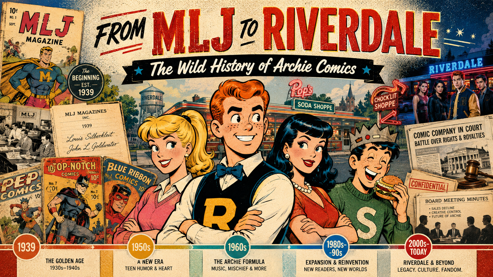
Archie Andrews may be comics’ eternal teenager, but the company behind Riverdale has lived a very adult life. It began with three Depression-era publishers and a line of superheroes, found its future in a clumsy redheaded high-school kid, survived changing tastes and changing generations, endured a spectacular family-business war, reinvented itself for television and horror, and is now entering yet another new era in 2026.
There is a temptation to treat Archie Comics as if it simply appeared one day fully formed: Archie, Betty, Veronica and Jughead sitting at Pop’s, forever seventeen, forever trapped in the world’s longest love triangle. The truth is considerably messier — and much more interesting.
This is the story of the founders, the artists, the heirs, the courtroom battles, the reinventions, and the strange durability of a company that has spent eighty-five years proving that Riverdale can bend without quite breaking.
Before Archie: Three Men, Three Initials, and a Superhero Publisher
Archie Comics did not begin as Archie Comics. In 1939, Maurice Coyne, Louis Silberkleit, and John L. Goldwater formed M.L.J. Magazines. The company name was wonderfully literal: M for Maurice, L for Louis, and J for John.
The three men brought different strengths. Coyne was the numbers man, an accountant who handled the financial side. Silberkleit had deep experience in publishing, printing, circulation and distribution. Goldwater was the editorial and creative force. Before comics, the partners had roots in the pulp-magazine business, and they entered comic books at exactly the right moment: Superman had exploded onto newsstands and every publisher in New York was looking for the next great costumed hero.
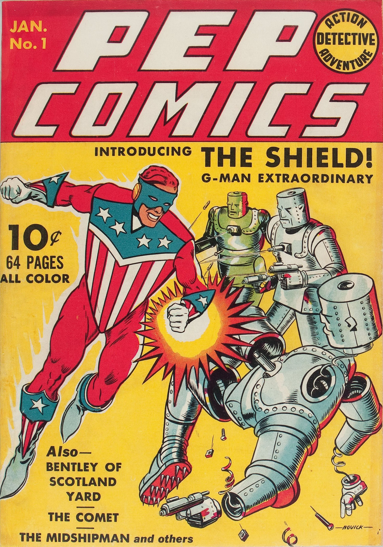
MLJ’s early books included Blue Ribbon Comics, Top-Notch Comics, and Pep Comics. The star of Pep was not a freckled teenager. It was The Shield, a patriotic superhero who debuted in Pep Comics #1 in early 1940 — more than a year before Captain America arrived.
That matters because it shows just how dramatic Archie’s arrival really was. MLJ was built to compete in the superhero boom. Then one awkward teenager walked into the back pages and eventually pushed the superheroes right off center stage.
John Goldwater’s Travels and the Search for an Everyman
Goldwater’s own life was far less sheltered than Riverdale. Orphaned young and raised in New York, he left home and traveled across the United States, taking odd jobs before eventually returning to the city and entering publishing. Later accounts describe him looking at the success of the Andy Hardy films and deciding comics needed something different from another invincible strongman: an ordinary American teenager whose disasters were recognizable.
That distinction is important. Archie was not powerful. He was not brilliant. He did not come from another planet. He was a decent kid who could trip over his own feet, wreck a date, irritate his teachers, disappoint two girls at once, and still somehow be invited back tomorrow.
The creation of Archie is best understood as a collaboration rather than a one-man miracle. Goldwater supplied the concept and editorial direction. Vic Bloom scripted the first published story. And a young artist named Bob Montana gave Archie and his world the visual personality that made the whole thing work.
Bob Montana: The Artist Who Gave Riverdale a Face
If John Goldwater supplied the premise, Bob Montana supplied something just as valuable: a lived-in world.
Montana had grown up around vaudeville. His father was a musician, his mother had performed onstage, and young Bob spent part of his childhood traveling. He later attended high school in Haverhill, Massachusetts, and Manchester, New Hampshire, keeping an illustrated diary and sketching the people around him. Those observations became raw material for Riverdale.
Friends, teachers, local personalities and even names from Montana’s life have long been connected to the Archie cast. His high-school surroundings helped shape Jughead, Moose, Mr. Weatherbee and Miss Grundy. The name Lodge has been linked to a prominent Massachusetts family Montana encountered. Riverdale felt convincing because beneath the exaggeration were pieces of real schools, real towns and real teenagers.
Archie Andrews, Betty Cooper and Jughead Jones debuted in Pep Comics #22, cover-dated December 1941. Veronica Lodge followed shortly afterward in Pep Comics #26. The response was enormous. What had begun as a humor feature inside a superhero comic rapidly became the reason readers were buying the book.
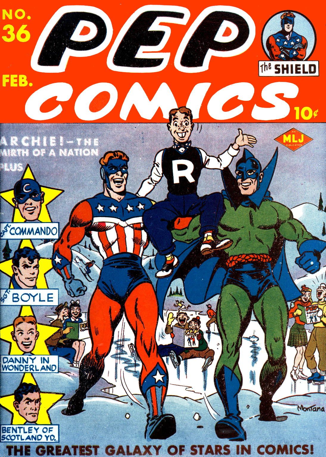
By the winter of 1942, Archie had his own title. By 1946, the character was important enough that MLJ formally became Archie Comic Publications. A newspaper strip followed, with Montana drawing the daily and Sunday Archie strip for decades.
Montana’s contribution can be obscured by the later Archie house style, but the DNA is his. The energy, the social comedy, the small-town texture and the sense that every adult in Riverdale is one headache away from throwing Archie out a window — that foundation was established early.
The Artists Who Made Archie Look Like Archie
Archie Comics became unusual among publishers because readers often recognized a consistent company look even when dozens of creators were working behind it. That visual identity was built by generations of artists, and several deserve special attention.
Harry Lucey: Motion, Mayhem, and Perfect Comic Timing
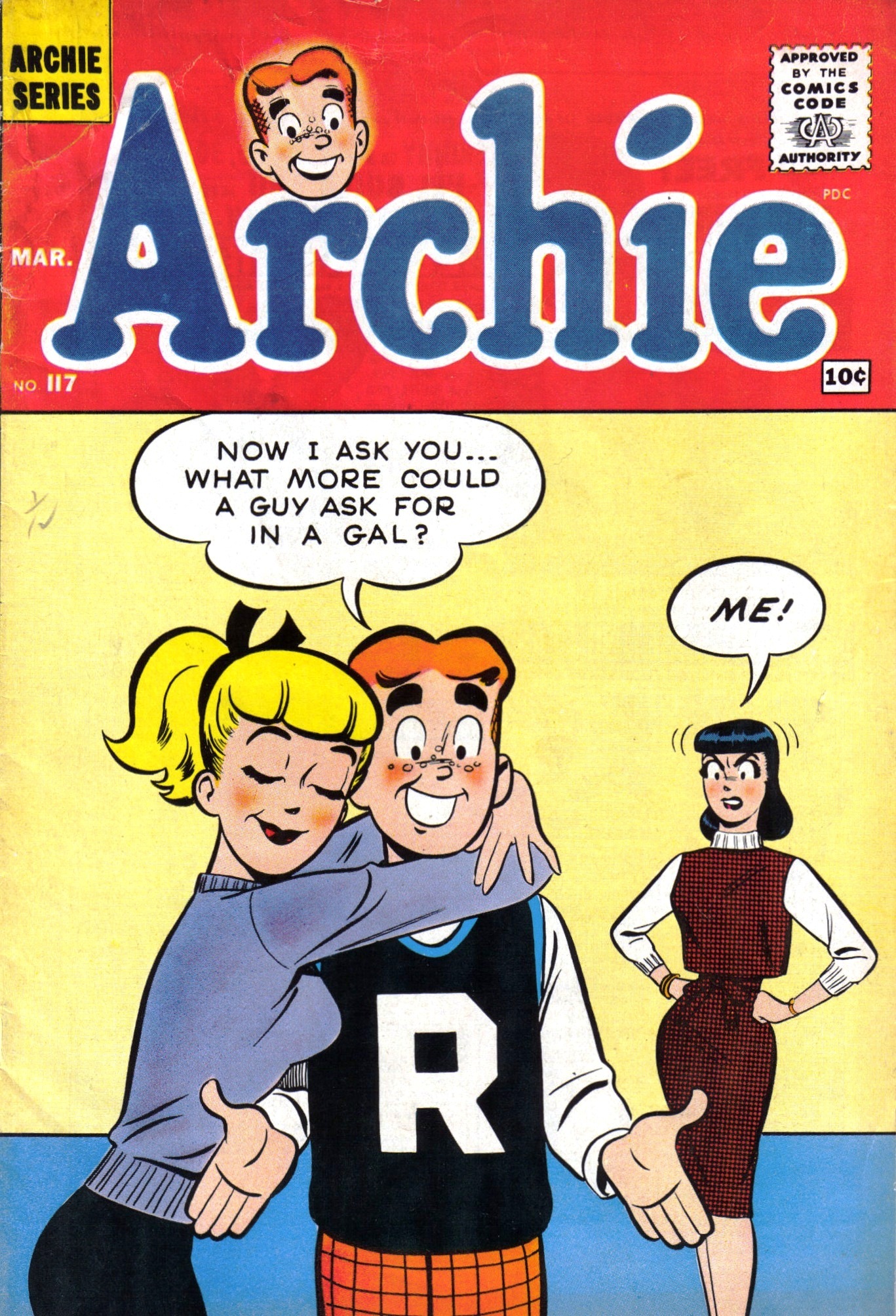
Harry Lucey worked for MLJ in the action-comics days and later became one of the defining Archie artists, particularly from the late 1950s through the mid-1970s. His characters moved. Bodies bent, faces snapped into expressions, and gags played out with almost animated timing. Lucey could turn Archie simply entering a room into a physical-comedy event.
Dan DeCarlo: The House Style
Then there was Dan DeCarlo. Beginning his Archie work in the late 1950s, DeCarlo modernized the gang so successfully that his version became, for generations, what people meant when they said “the Archie style.” Betty’s ponytail, Veronica’s fashion, the cleaner silhouettes, the attractive-but-cartooned proportions — DeCarlo’s influence spread across the line.
His reach extended far beyond the central love triangle. He was deeply associated with Josie and the Pussycats and, with writer George Gladir, the 1962 debut of Sabrina the Teenage Witch. Archie was no longer merely one teenage boy’s comic. It had become a whole expandable universe.
Samm Schwartz, Bob Bolling, Stan Goldberg — and a Deep Bench
Samm Schwartz became the great Jughead specialist, giving Archie’s burger-obsessed best friend a rubbery, eccentric visual life of his own. Bob Bolling transformed Little Archie into something more atmospheric and adventurous than a simple kiddie spin-off. Later, artists such as Stan Goldberg carried the classic style into new generations.
The important point is that Archie’s longevity was never the work of one hand. Montana created the visual foundation; Lucey brought kinetic comedy; DeCarlo refined the iconic house look; Schwartz made Jughead sing; Bolling expanded what an Archie story could feel like. Riverdale survived because artists kept rebuilding it without making it unrecognizable.
Archie Becomes More Than a Comic Book
By the 1960s, Archie had become a genuine American pop-culture machine. The Archie Show arrived on television in 1968, and the fictional band The Archies became bizarrely, wonderfully real. In 1969, “Sugar, Sugar” reached No. 1 on the Billboard Hot 100 and stayed there for four weeks.
Think about that for a moment. A supporting gag about teenagers in a garage band turned into one of the biggest pop singles of the year. Riverdale had escaped the comic page.
The company also expanded into Sabrina, Josie, Katy Keene, Little Archie, superhero revivals, digests, animation and licensing. At the same time, John Goldwater became a major force in the Comics Magazine Association of America and the Comics Code era — one of the stranger historical ironies in comics. The publisher built around harmless teenage trouble helped oversee the industry’s system for deciding what comic-book trouble was acceptable.
The First Heirs: Richard Goldwater and Michael Silberkleit
Family succession eventually became central to Archie’s story.
In the early 1980s, Richard Goldwater, John’s son, and Michael Silberkleit, Louis’s son, took control of the company. Archie had spent a period as a publicly traded business, but the two sons bought back the public shares in 1983 and returned it to private ownership. Each side controlled half of the company. Richard served as president and co-publisher; Michael as chairman and co-publisher.
For decades, that second generation maintained the basic Archie formula while keeping it commercially current. Technology changed. Clothes changed. Social concerns crept into stories. The digest format became an Archie stronghold. But the company still operated like a peculiar family inheritance whose greatest asset was a teenager who never aged.
Then the succession plan was hit by two deaths in quick order. Richard Goldwater died in 2007. Michael Silberkleit died in 2008.
And this is where Riverdale’s real-life story became considerably less wholesome than the comics.
The Boardroom War: Nancy Silberkleit, Jon Goldwater, and the Fight That Nearly Buried Riverdale
After Michael Silberkleit’s death, his widow, Nancy Silberkleit, entered the company’s leadership. In 2009 she and Jonathan “Jon” Goldwater, John Goldwater’s son and Richard’s half-brother, became co-chief executives.
On paper, the arrangement preserved the old balance between the Silberkleit and Goldwater families. In practice, it became a corporate civil war.
According to New York court records, Nancy’s employment agreement gave her final authority over certain scholastic and theatrical matters, while Jon held final responsibility for most other company business. By 2011, Archie Comic Publications had sued Nancy and sought restrictions on her interactions with employees and vendors. The case included allegations from employees of disruptive, abusive and inappropriate workplace behavior. Nancy denied key allegations against her.
In November 2011, Justice Shirley Werner Kornreich issued a preliminary injunction restricting Nancy from harassing, yelling at or abusing people at the Archie offices and limiting her contacts with employees and vendors outside the areas assigned to her. A later court record states that she was subsequently held in civil contempt over compliance with the order.
Jon Goldwater then filed a separate action in January 2012 seeking to remove Nancy as a director and co-CEO. The litigation sprawled across corporate and estate matters before the central company disputes were sent to mediation. A May 30, 2012 memorandum of understanding settled the New York County actions and established a liaison arrangement governing Nancy’s interaction with Archie matters. Estate and trust disputes continued afterward.
It is difficult to overstate how extraordinary this period was. Archie Comics was a small, closely held company whose value depended heavily on stability, licensing relationships and a family-owned intellectual property library. Instead, its two ownership camps were fighting in court while the publishing industry itself was being transformed by digital comics, declining newsstand sales and new entertainment competition.
Yet the company did not collapse. In fact, while the legal war was unfolding, Archie began taking some of the biggest creative risks in its history.
The Reinvention Years: Kevin Keller, Horror, and a New Archie #1
Under Jon Goldwater’s publishing leadership, the company pushed harder into digital distribution and deliberately tested the limits of what readers thought an Archie comic could be.
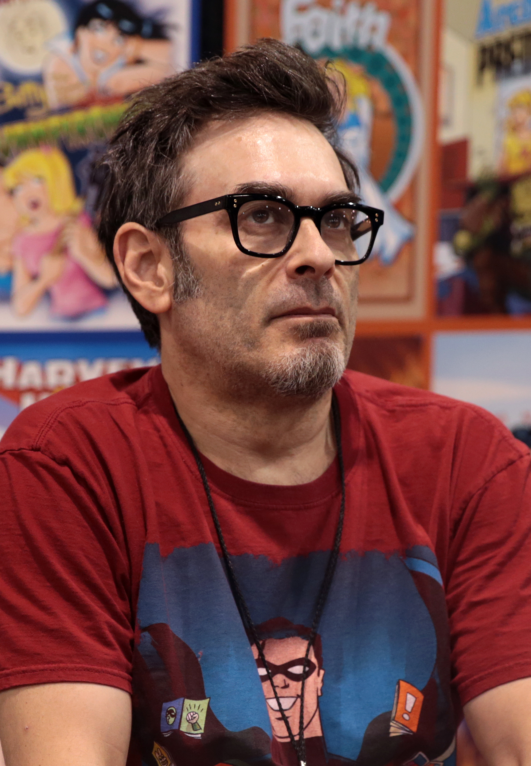
One of the most important additions came from longtime Archie writer-artist Dan Parent. In Veronica #202 in 2010, Parent introduced Kevin Keller, Archie Comics’ first openly gay character. The issue sold out and was reprinted — a first for Archie — and Kevin went on to headline his own stories.
Then came Afterlife with Archie in 2013, written by Roberto Aguirre-Sacasa with art by Francesco Francavilla. Zombies in Riverdale sounded like a joke until readers saw the result. The series demonstrated that the Archie cast could be placed inside genuine horror without losing their identities. The Archie Horror line followed, including Chilling Adventures of Sabrina.
In 2015, Archie went even further: the flagship was relaunched with a new Archie #1 by writer Mark Waid and artist Fiona Staples. It was a modern Riverdale with contemporary pacing, design and emotional texture, but the essential relationships remained intact.

That relaunch was followed by new versions of Jughead, Betty & Veronica, and other titles. Archie had finally learned the trick that would define its modern identity: the classic version did not have to disappear for alternate versions to exist. Digests could preserve the familiar DeCarlo-influenced world while horror, prestige comics and television explored wildly different Riverdales.
Riverdale Goes Primetime
Television took that philosophy and ran with it.
Riverdale premiered on The CW in 2017, transforming the characters into the inhabitants of a glossy, dangerous teen drama filled with murder, secrets, sex, conspiracies and neon. It was emphatically not the Riverdale of a 1960s digest — and that was precisely the point.
The show ran seven seasons and turned Archie, Betty, Veronica, Jughead and Cheryl into contemporary television characters for an audience that might never have picked up an Archie comic. Chilling Adventures of Sabrina made a similar leap to streaming horror, while Netflix’s 2023 film The Archies reimagined the property in India.
By then Archie was no longer one continuity. It was a set of extremely durable character relationships that could be translated into comedy, horror, melodrama, music, nostalgia or young-adult storytelling.
Archie in 2026: Eighty-Five Years Old and Starting Over Again
And now we arrive at today — August 2026 — with Archie preparing for another major publishing reinvention.
Archie Comics and Oni Press announced a new publishing partnership timed to the 85th anniversary of Archie’s debut in Pep Comics #22. The new line begins this fall with an all-new Archie #1, written by W. Maxwell Prince with art by Fábio Moon and Nick Cagnetti, scheduled for September 2026.
That will be followed by Sabrina the Teenage Witch #1 by Corinna Bechko and Kano in October, and Archie in Hell #1 by Patrick Horvath and Tyler Crook in November. Collections and additional formats are planned after that.
It is difficult to imagine a better summary of Archie’s survival strategy. The company that once displaced its own superheroes with a teenage comedy is now willing to hand those same characters to distinctive modern creators and ask, once again: what else can Riverdale be?
But the Real-Life Business Drama Is Not Over
There is one more chapter, and it is still being written.
In 2026, financial-news service 9fin reported on a complex dispute between Jon Goldwater and Raven Capital arising from a $40 million financing arrangement made in 2022. The collateral and related agreements touch Goldwater-controlled entities, media-development rights, and a family-office interest that includes a 25 percent stake in Archie Comic Publications.
Raven moved toward a UCC foreclosure sale involving that family-office interest, while Goldwater challenged the effort in court. On August 20, 2026, New York’s Appellate Division granted Goldwater an injunction pending appeal to the extent described in its order, pausing enforcement while the appeal proceeds.
This does not mean Archie Comics has been sold, foreclosed, or shut down. The dispute concerns Goldwater-related collateral and ownership interests, and the litigation remains unresolved. 2026 reporting based on the underlying agreements describes Archie’s equity as divided between the Goldwater and Silberkleit sides, continuing the family structure that has shaped the company for generations.
A Universal film project was also announced in 2025, but the current litigation has made the status of some media rights and future development less clear. Meanwhile, the comics themselves continue to ship, anniversary material is appearing on shelves, and the Oni publishing line is moving toward launch.
So yes: eighty-five years after Archie first appeared, there is once again a legal and financial storm outside Pop’s Chock’lit Shoppe.
And somehow Jughead is probably still worried about the hamburger.
Why Archie Keeps Surviving
There are comic characters with greater powers. There are publishers with larger corporate parents. There are franchises with vastly bigger movie budgets.
But Archie has something unusual: structural flexibility.
Archie and Betty can be innocent 1940s teenagers. Betty and Veronica can wear the fashions of 1961. Kevin Keller can walk into Riverdale in 2010 and belong there. Jughead can fight zombies. Sabrina can become gothic horror. Archie can be the center of a CW murder mystery. The same characters can then turn around and appear in a digest that feels comfortingly familiar.
The company’s business history has been considerably rougher than its smiling logo suggests. Founders died. Sons inherited. Heirs fought. Courts intervened. Markets changed. Newsstands vanished. Television deals came and went. Debt and ownership disputes arrived.
But the central machine has kept working because Riverdale was never really a place. It was a relationship map: Archie between Betty and Veronica; Jughead beside Archie; Reggie needling everyone; adults trying to keep order; teenagers convinced every Friday night is the most important night in human history.
That is why Bob Montana’s sketches still matter. It is why DeCarlo’s silhouettes remain instantly recognizable. It is why Dan Parent could add Kevin Keller without breaking the world. It is why Fiona Staples could redesign the gang and still make them feel like Archie. And it is why, in September 2026, another creative team gets to open the doors to Riverdale all over again.
Archie Andrews is still seventeen.
The history behind him is anything but.
Selected Sources
- Archie Comics — About Us
- Archie Comics — Archie Comics and Oni Press publishing partnership
- Los Angeles Times — John L. Goldwater obituary
- New England Historical Society — Bob Montana and the real-world roots of Riverdale
- New York Supreme Court record — Archie Comic Publications v. Silberkleit (2011)
- New York State Law Reporting Bureau — Matter of Levitin (Silberkleit), 2015
- 9fin — 2026 reporting on the Goldwater/Raven financing dispute
- New York Appellate Division order, August 20, 2026 — Goldwater v. Raven
Image Credits
- Pep Comics #1 (1940), Irv Novick — public domain in the United States. Wikimedia Commons source.
- Pep Comics #36 (1943), Bob Montana — public domain in the United States. Wikimedia Commons source.
- Archie #117 (1961), Harry Lucey and Terry Szenics — public domain in the United States. Wikimedia Commons source.
- Dan Parent photo by Gage Skidmore — CC BY-SA 3.0. Wikimedia Commons source.
- Fiona Staples photo by Sergei Scurfield — CC BY-SA 2.0. Wikimedia Commons source.


.jpg)


.jpg)