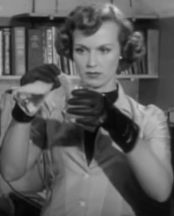
Noreen Nash as Barbara Randall in Phantom from Space · 1953 film still · Public domain in the United States
The Pink Room Picture Show
Something landed. Then it vanished.
A visitor tears across radar screens from Alaska to California, crashes near Santa Monica and leaves authorities hunting something they cannot see, cannot understand and may not be able to keep alive.
1953Science Fiction 70–72 MinutesBlack & White Invisible Alien
Hello, my darlings. Before flying saucers became polished silver icons and movie aliens arrived with elaborate empires behind them, Phantom from Space imagined first contact as something much stranger: a frightened visitor, a radioactive suit, a trail of static—and an invisible body moving through the California night.
Released in 1953 and directed by W. Lee Wilder, this compact little science-fiction thriller sits right at the crossroads of postwar UFO fever, atomic-age anxiety and the semi-documentary crime pictures that loved official voices, radar rooms and men in government offices explaining that something impossible had just happened.
It does not begin with a monster. It begins with a signal.
Watch the complete movie with Veronica in the Pink Room
Title
Phantom from Space
Release
May 15, 1953
Directed by
W. Lee Wilder
Written by
Bill Raynor and Myles Wilder
Starring
Ted Cooper, Rudolph Anders, James Seay, Noreen Nash and Dick Sands
Music by
William Lava
Production
Planet Filmplays, Inc.
Runtime
Approximately 70–72 minutes
A Visitor Falls Out of the Sky
The movie opens with authority. Radar stations track an unidentified object screaming south from Alaska at impossible speed. It loses altitude, crosses the country and disappears from radar near Santa Monica. Almost immediately, radio and television interference begins to spread through the area.
Mobile communications crews are dispatched to locate the source. What they find is not wreckage neatly waiting to be photographed. They find frightened witnesses, injured men and reports of a strange figure wearing what looks like a heavy diving suit and helmet.
The government men follow the disturbances toward the San Fernando Valley and an observatory laboratory, where scientists begin to suspect that the suit is not merely protective clothing. It is keeping its wearer alive.
The most unsettling thing in Phantom from Space is not that the visitor can disappear. It is that nobody knows whether he is hunting us—or simply trying to survive us.
The Monster We Cannot See
The central gimmick is beautifully simple. Once the alien removes his suit, he becomes invisible to human eyes. Doors open by themselves. Equipment moves. Footsteps and alarms announce a presence the characters cannot locate. The movie turns a modest budget into an advantage because absence becomes the special effect.
There is a practical reason for the invisibility inside the story as well. Dr. Wyatt theorizes that the visitor’s body may be based on chemistry unlike our own, and ultraviolet light can reveal traces of him. His strange helmet contains the gas he needs to breathe. Without it, every minute on Earth becomes more dangerous.
That detail changes the mood. The Phantom is dangerous, certainly, and people are hurt in the panic surrounding his arrival. But the film gradually presents him less as a conquering invader than as a stranded being trapped in an environment that is killing him while terrified humans close in.
Government Men, Static and Atomic-Age Fear
Wilder directs much of the picture like a procedural. The American Film Institute notes the film’s documentary-style narration, and that tone gives the opening sections an almost official seriousness. Communications trucks, military personnel, laboratory workers and radar operators treat the impossible as another problem to be logged, triangulated and contained.
That is pure early-1950s science fiction. The unknown arrives through technology before it arrives through character. We see it first as a radar trace, a disturbance in radio signals and a problem moving through networks designed to keep the modern world connected.
The picture also belongs to the same cultural moment that produced endless headlines and movies about flying saucers, radiation and visitors from beyond Earth. Instead of building enormous effects sequences, Phantom from Space keeps those anxieties close to the ground. Its alien hides in laboratories, crosses roads at night and turns familiar Southern California locations into a place where ordinary rules no longer quite apply.
✦ SIGNAL LOST · SIGNAL FOUND ✦
Noreen Nash and the Human Face of the Story
Noreen Nash plays Barbara Randall, one of the laboratory figures drawn directly into the encounter. She becomes especially important once the scientists realize the alien may be trying to communicate by tapping out a repeated pattern.
That possibility—communication instead of simple destruction—is where the movie becomes more interesting than its pulpy title suggests. The Phantom is silent, visually absent and physically incompatible with our atmosphere. Human beings can barely perceive him, much less understand him. Yet there are moments when both sides seem to be reaching toward the same goal: make contact before fear or biology makes contact impossible.
Dick Sands performs the Phantom when the creature is finally revealed, while Rudolph Anders plays Dr. Wyatt and James Seay appears as Major Andrews. The supporting cast gives the picture the sturdy, no-nonsense rhythm of a low-budget procedural, which makes the increasingly bizarre situation feel oddly grounded.
A Movie Built Around What It Cannot Show
Low-budget science fiction often becomes most inventive when it cannot afford spectacle. Here, invisibility lets the movie suggest more than it displays. A helmet seems to float. Objects move without hands. Ultraviolet light becomes a weapon, a scientific instrument and a theatrical trick all at once.
The climactic reveal is brief but memorable. Once the trapped visitor is made visible, the image is not triumphant. It is tragic. The alien is weakened, exposed and unable to remain in our world. His body begins to break down as the humans finally understand just how little time he had.
That ending gives the movie a melancholy aftertaste. The title promises a phantom, but what remains is the idea of a traveler who crossed an impossible distance only to die almost immediately after arriving.
Why It Still Belongs in the Pink Room
Phantom from Space is exactly the kind of picture I love rescuing from the “old cheap sci-fi” label. Yes, the budget is visible. Yes, the science takes enthusiastic liberties. Yes, some of the performances have that wonderfully square 1950s seriousness that can make modern audiences smile.
But look past that and there is a smart little concept underneath it: first contact told from the perspective of people who can detect the visitor without truly seeing him. The movie builds suspense out of static, silence, laboratory equipment and the dreadful possibility that everyone may be misunderstanding the same event.
It is eerie rather than enormous, strange rather than spectacular, and just sad enough at the end to linger after the flying-saucer excitement is over.
Sources & Further Reading
AFI Catalog: Phantom from Space — release information, production credits, cast, synopsis and the film’s documentary-style narration.
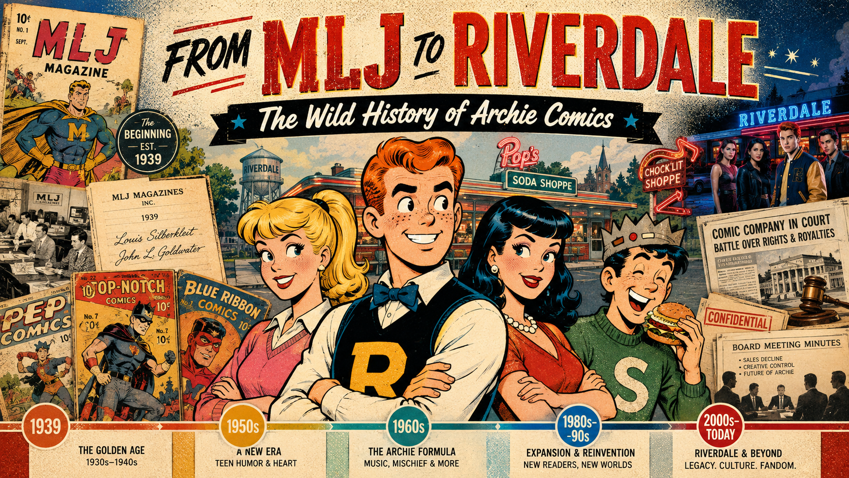
Archie Andrews may be comics’ eternal teenager, but the company behind Riverdale has lived a very adult life. It began with three Depression-era publishers and a line of superheroes, found its future in a clumsy redheaded high-school kid, survived changing tastes and changing generations, endured a spectacular family-business war, reinvented itself for television and horror, and is now entering yet another new era in 2026.
There is a temptation to treat Archie Comics as if it simply appeared one day fully formed: Archie, Betty, Veronica and Jughead sitting at Pop’s, forever seventeen, forever trapped in the world’s longest love triangle. The truth is considerably messier — and much more interesting.
This is the story of the founders, the artists, the heirs, the courtroom battles, the reinventions, and the strange durability of a company that has spent eighty-five years proving that Riverdale can bend without quite breaking.
Before Archie: Three Men, Three Initials, and a Superhero Publisher
Archie Comics did not begin as Archie Comics. In 1939, Maurice Coyne, Louis Silberkleit, and John L. Goldwater formed M.L.J. Magazines. The company name was wonderfully literal: M for Maurice, L for Louis, and J for John.
The three men brought different strengths. Coyne was the numbers man, an accountant who handled the financial side. Silberkleit had deep experience in publishing, printing, circulation and distribution. Goldwater was the editorial and creative force. Before comics, the partners had roots in the pulp-magazine business, and they entered comic books at exactly the right moment: Superman had exploded onto newsstands and every publisher in New York was looking for the next great costumed hero.
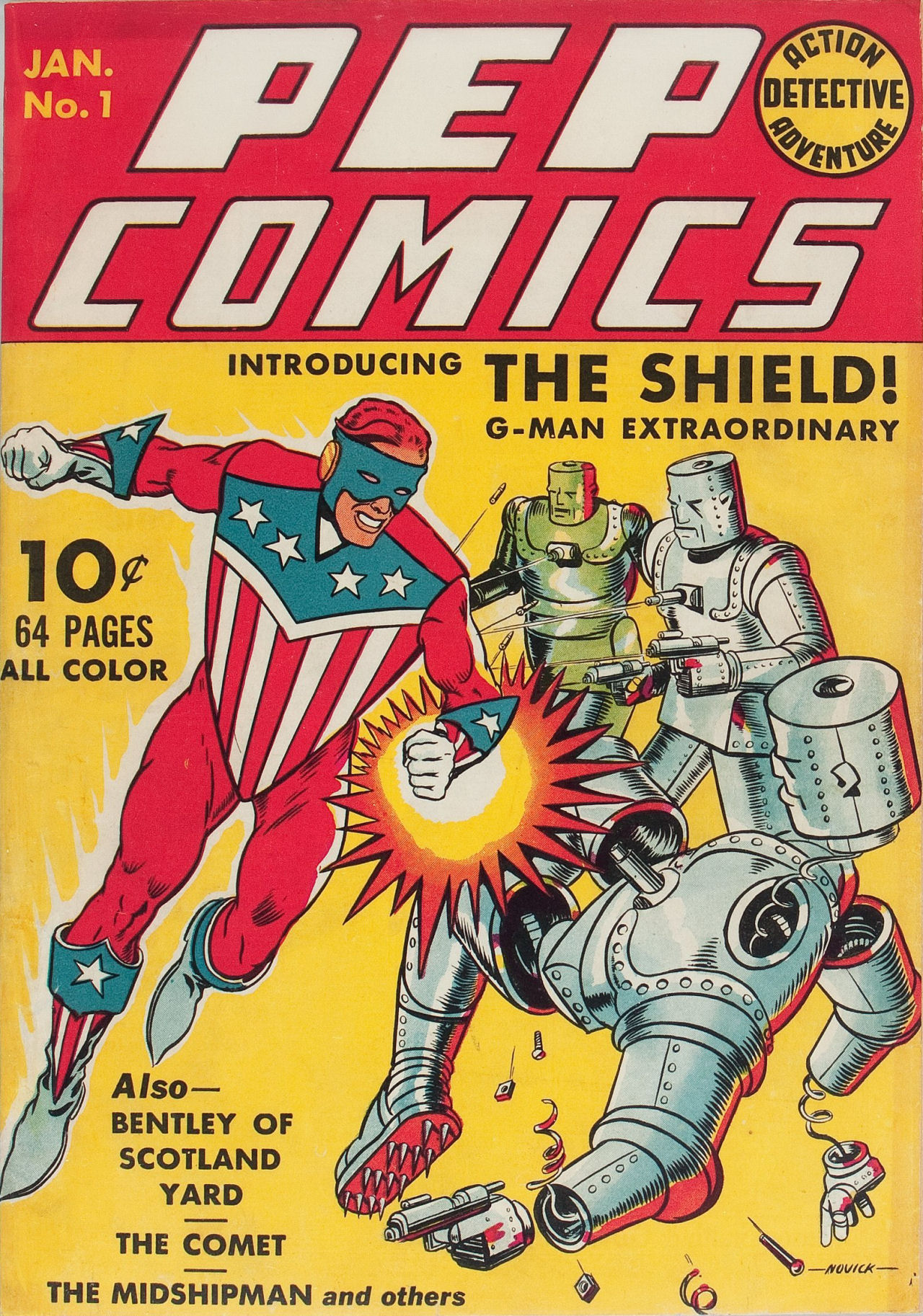
MLJ’s early books included Blue Ribbon Comics, Top-Notch Comics, and Pep Comics. The star of Pep was not a freckled teenager. It was The Shield, a patriotic superhero who debuted in Pep Comics #1 in early 1940 — more than a year before Captain America arrived.
Pep Comics #1 (1940), cover by Irv Novick. Public domain in the United States; image via Wikimedia Commons.
That matters because it shows just how dramatic Archie’s arrival really was. MLJ was built to compete in the superhero boom. Then one awkward teenager walked into the back pages and eventually pushed the superheroes right off center stage.
John Goldwater’s Travels and the Search for an Everyman
Goldwater’s own life was far less sheltered than Riverdale. Orphaned young and raised in New York, he left home and traveled across the United States, taking odd jobs before eventually returning to the city and entering publishing. Later accounts describe him looking at the success of the Andy Hardy films and deciding comics needed something different from another invincible strongman: an ordinary American teenager whose disasters were recognizable.
That distinction is important. Archie was not powerful. He was not brilliant. He did not come from another planet. He was a decent kid who could trip over his own feet, wreck a date, irritate his teachers, disappoint two girls at once, and still somehow be invited back tomorrow.
The creation of Archie is best understood as a collaboration rather than a one-man miracle. Goldwater supplied the concept and editorial direction. Vic Bloom scripted the first published story. And a young artist named Bob Montana gave Archie and his world the visual personality that made the whole thing work.
Bob Montana: The Artist Who Gave Riverdale a Face
If John Goldwater supplied the premise, Bob Montana supplied something just as valuable: a lived-in world.
Montana had grown up around vaudeville. His father was a musician, his mother had performed onstage, and young Bob spent part of his childhood traveling. He later attended high school in Haverhill, Massachusetts, and Manchester, New Hampshire, keeping an illustrated diary and sketching the people around him. Those observations became raw material for Riverdale.
Friends, teachers, local personalities and even names from Montana’s life have long been connected to the Archie cast. His high-school surroundings helped shape Jughead, Moose, Mr. Weatherbee and Miss Grundy. The name Lodge has been linked to a prominent Massachusetts family Montana encountered. Riverdale felt convincing because beneath the exaggeration were pieces of real schools, real towns and real teenagers.
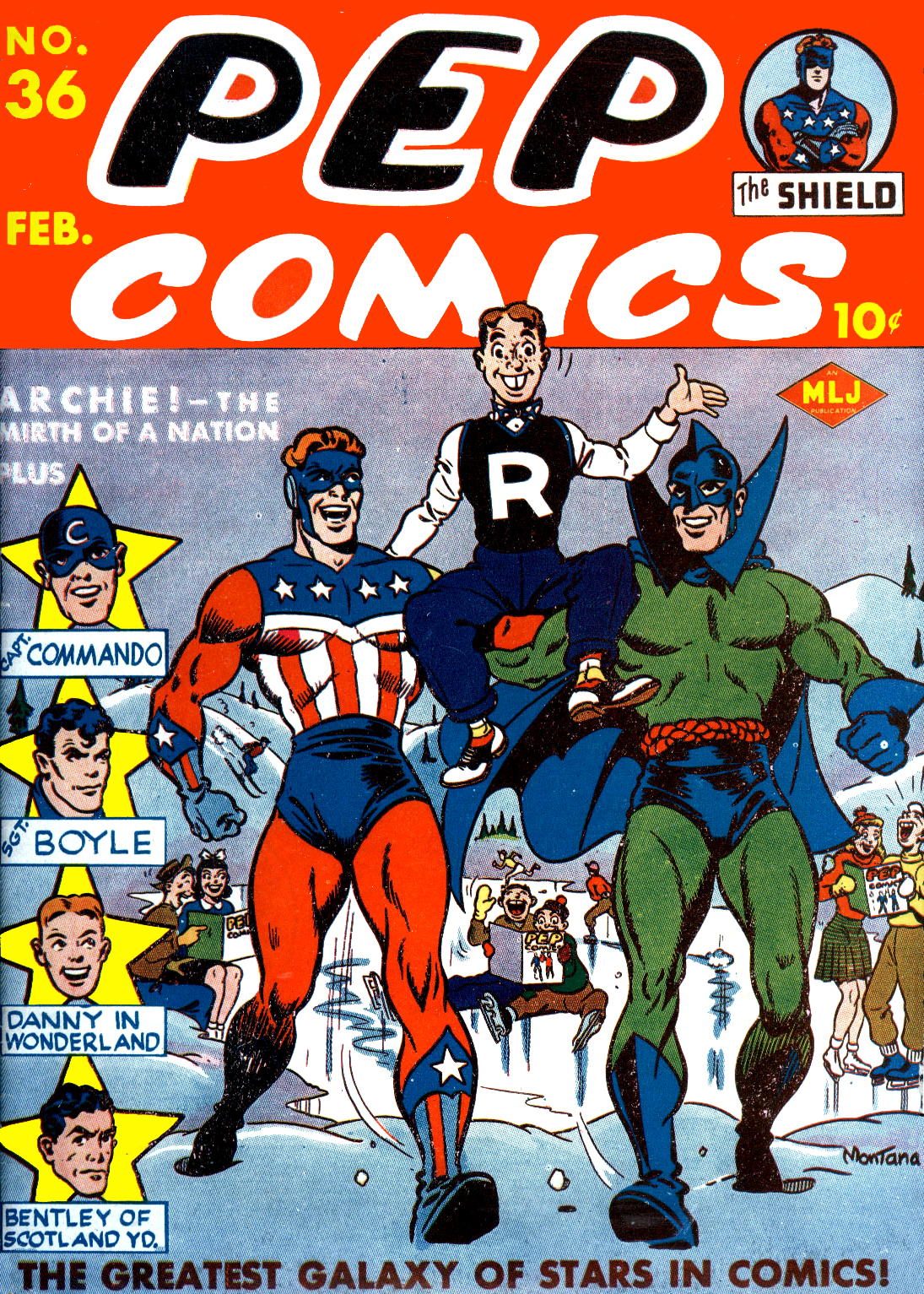
Archie Andrews, Betty Cooper and Jughead Jones debuted in Pep Comics #22, cover-dated December 1941. Veronica Lodge followed shortly afterward in Pep Comics #26. The response was enormous. What had begun as a humor feature inside a superhero comic rapidly became the reason readers were buying the book.
Bob Montana’s cover for Pep Comics #36 (February 1943) perfectly captures the transition: Archie shares the cover with MLJ superheroes The Shield and The Hangman. Public domain in the United States; image via Wikimedia Commons.
By the winter of 1942, Archie had his own title. By 1946, the character was important enough that MLJ formally became Archie Comic Publications. A newspaper strip followed, with Montana drawing the daily and Sunday Archie strip for decades.
Montana’s contribution can be obscured by the later Archie house style, but the DNA is his. The energy, the social comedy, the small-town texture and the sense that every adult in Riverdale is one headache away from throwing Archie out a window — that foundation was established early.
The Artists Who Made Archie Look Like Archie
Archie Comics became unusual among publishers because readers often recognized a consistent company look even when dozens of creators were working behind it. That visual identity was built by generations of artists, and several deserve special attention.
Harry Lucey: Motion, Mayhem, and Perfect Comic Timing
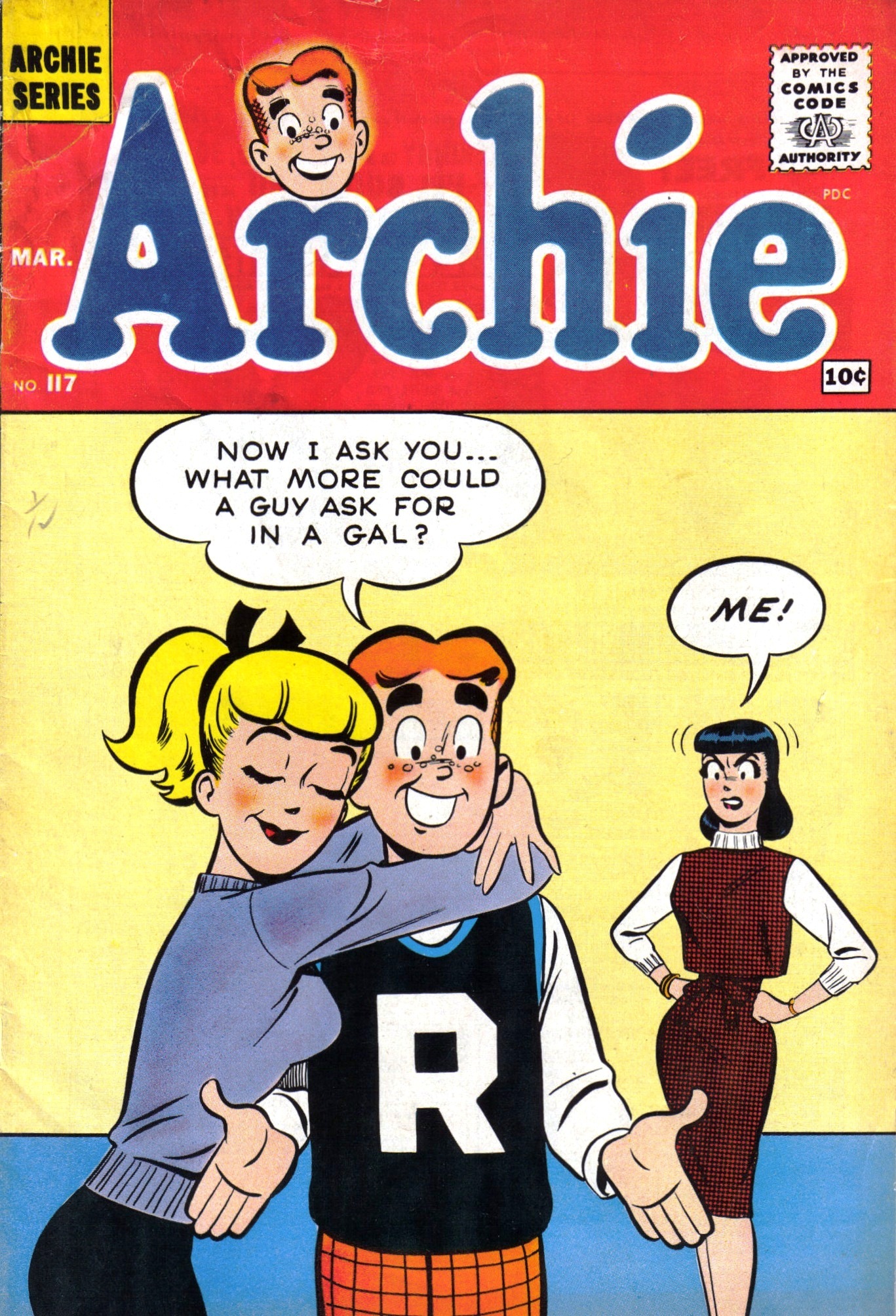
Harry Lucey worked for MLJ in the action-comics days and later became one of the defining Archie artists, particularly from the late 1950s through the mid-1970s. His characters moved. Bodies bent, faces snapped into expressions, and gags played out with almost animated timing. Lucey could turn Archie simply entering a room into a physical-comedy event.
Archie #117 (1961), pencils by Harry Lucey and inks by Terry Szenics. Public domain in the United States; image via Wikimedia Commons.
Dan DeCarlo: The House Style
Then there was Dan DeCarlo. Beginning his Archie work in the late 1950s, DeCarlo modernized the gang so successfully that his version became, for generations, what people meant when they said “the Archie style.” Betty’s ponytail, Veronica’s fashion, the cleaner silhouettes, the attractive-but-cartooned proportions — DeCarlo’s influence spread across the line.
His reach extended far beyond the central love triangle. He was deeply associated with Josie and the Pussycats and, with writer George Gladir, the 1962 debut of Sabrina the Teenage Witch. Archie was no longer merely one teenage boy’s comic. It had become a whole expandable universe.
Samm Schwartz, Bob Bolling, Stan Goldberg — and a Deep Bench
Samm Schwartz became the great Jughead specialist, giving Archie’s burger-obsessed best friend a rubbery, eccentric visual life of his own. Bob Bolling transformed Little Archie into something more atmospheric and adventurous than a simple kiddie spin-off. Later, artists such as Stan Goldberg carried the classic style into new generations.
The important point is that Archie’s longevity was never the work of one hand. Montana created the visual foundation; Lucey brought kinetic comedy; DeCarlo refined the iconic house look; Schwartz made Jughead sing; Bolling expanded what an Archie story could feel like. Riverdale survived because artists kept rebuilding it without making it unrecognizable.
Archie Becomes More Than a Comic Book
By the 1960s, Archie had become a genuine American pop-culture machine. The Archie Show arrived on television in 1968, and the fictional band The Archies became bizarrely, wonderfully real. In 1969, “Sugar, Sugar” reached No. 1 on the Billboard Hot 100 and stayed there for four weeks.
Think about that for a moment. A supporting gag about teenagers in a garage band turned into one of the biggest pop singles of the year. Riverdale had escaped the comic page.
The company also expanded into Sabrina, Josie, Katy Keene, Little Archie, superhero revivals, digests, animation and licensing. At the same time, John Goldwater became a major force in the Comics Magazine Association of America and the Comics Code era — one of the stranger historical ironies in comics. The publisher built around harmless teenage trouble helped oversee the industry’s system for deciding what comic-book trouble was acceptable.
The First Heirs: Richard Goldwater and Michael Silberkleit
Family succession eventually became central to Archie’s story.
In the early 1980s, Richard Goldwater, John’s son, and Michael Silberkleit, Louis’s son, took control of the company. Archie had spent a period as a publicly traded business, but the two sons bought back the public shares in 1983 and returned it to private ownership. Each side controlled half of the company. Richard served as president and co-publisher; Michael as chairman and co-publisher.
For decades, that second generation maintained the basic Archie formula while keeping it commercially current. Technology changed. Clothes changed. Social concerns crept into stories. The digest format became an Archie stronghold. But the company still operated like a peculiar family inheritance whose greatest asset was a teenager who never aged.
Then the succession plan was hit by two deaths in quick order. Richard Goldwater died in 2007. Michael Silberkleit died in 2008.
And this is where Riverdale’s real-life story became considerably less wholesome than the comics.
The Boardroom War: Nancy Silberkleit, Jon Goldwater, and the Fight That Nearly Buried Riverdale
After Michael Silberkleit’s death, his widow, Nancy Silberkleit, entered the company’s leadership. In 2009 she and Jonathan “Jon” Goldwater, John Goldwater’s son and Richard’s half-brother, became co-chief executives.
On paper, the arrangement preserved the old balance between the Silberkleit and Goldwater families. In practice, it became a corporate civil war.
According to New York court records, Nancy’s employment agreement gave her final authority over certain scholastic and theatrical matters, while Jon held final responsibility for most other company business. By 2011, Archie Comic Publications had sued Nancy and sought restrictions on her interactions with employees and vendors. The case included allegations from employees of disruptive, abusive and inappropriate workplace behavior. Nancy denied key allegations against her.
In November 2011, Justice Shirley Werner Kornreich issued a preliminary injunction restricting Nancy from harassing, yelling at or abusing people at the Archie offices and limiting her contacts with employees and vendors outside the areas assigned to her. A later court record states that she was subsequently held in civil contempt over compliance with the order.
Jon Goldwater then filed a separate action in January 2012 seeking to remove Nancy as a director and co-CEO. The litigation sprawled across corporate and estate matters before the central company disputes were sent to mediation. A May 30, 2012 memorandum of understanding settled the New York County actions and established a liaison arrangement governing Nancy’s interaction with Archie matters. Estate and trust disputes continued afterward.
It is difficult to overstate how extraordinary this period was. Archie Comics was a small, closely held company whose value depended heavily on stability, licensing relationships and a family-owned intellectual property library. Instead, its two ownership camps were fighting in court while the publishing industry itself was being transformed by digital comics, declining newsstand sales and new entertainment competition.
Yet the company did not collapse. In fact, while the legal war was unfolding, Archie began taking some of the biggest creative risks in its history.
The Reinvention Years: Kevin Keller, Horror, and a New Archie #1
Under Jon Goldwater’s publishing leadership, the company pushed harder into digital distribution and deliberately tested the limits of what readers thought an Archie comic could be.
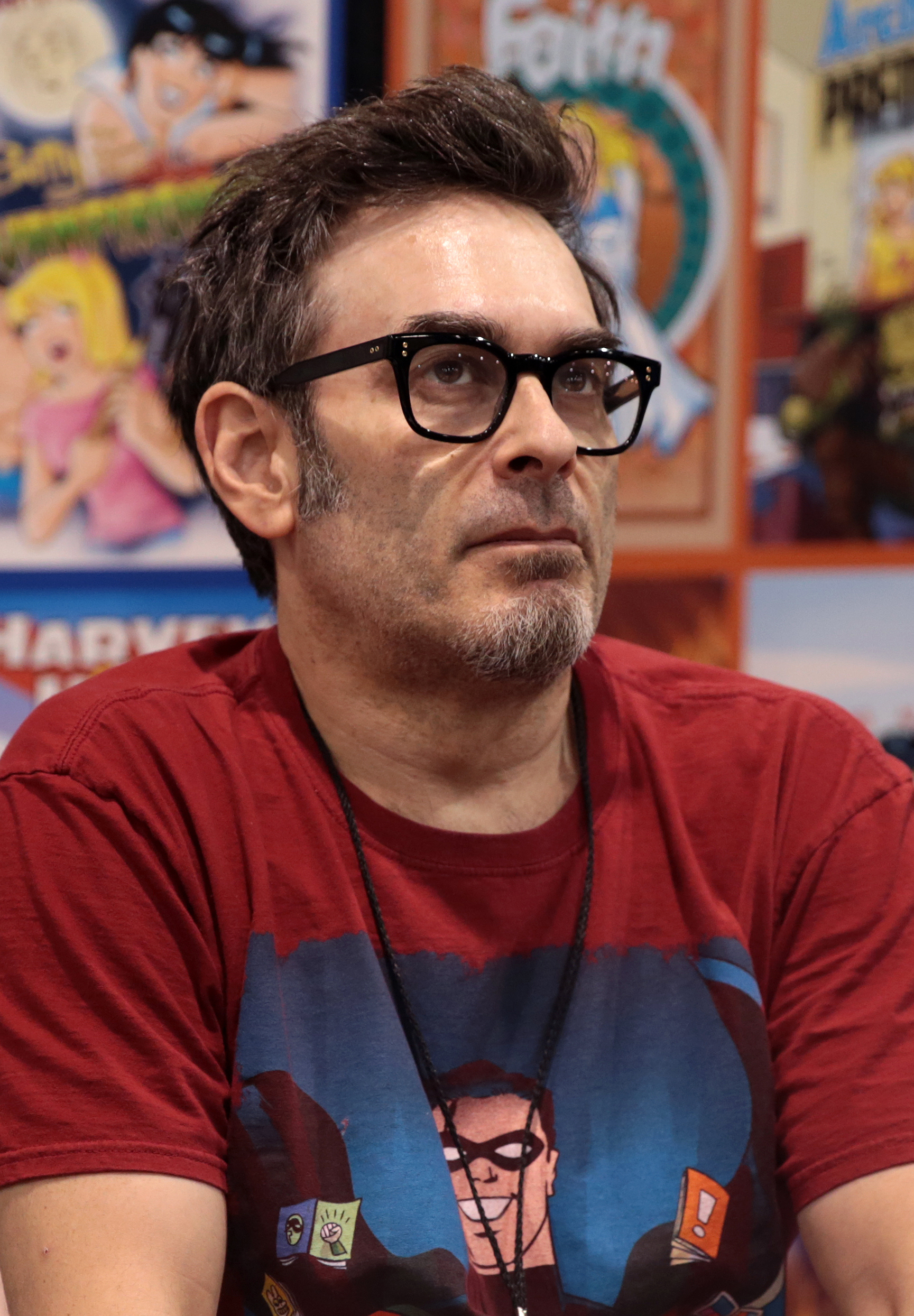
One of the most important additions came from longtime Archie writer-artist Dan Parent. In Veronica #202 in 2010, Parent introduced Kevin Keller, Archie Comics’ first openly gay character. The issue sold out and was reprinted — a first for Archie — and Kevin went on to headline his own stories.
Dan Parent, creator of Kevin Keller and one of the defining modern Archie creators. Photo by Gage Skidmore, CC BY-SA 3.0, via Wikimedia Commons.
Then came Afterlife with Archie in 2013, written by Roberto Aguirre-Sacasa with art by Francesco Francavilla. Zombies in Riverdale sounded like a joke until readers saw the result. The series demonstrated that the Archie cast could be placed inside genuine horror without losing their identities. The Archie Horror line followed, including Chilling Adventures of Sabrina.
In 2015, Archie went even further: the flagship was relaunched with a new Archie #1 by writer Mark Waid and artist Fiona Staples. It was a modern Riverdale with contemporary pacing, design and emotional texture, but the essential relationships remained intact.
Fiona Staples, the artist who helped launch the modern Archie #1 in 2015. Photo by Sergei Scurfield, CC BY-SA 2.0, via Wikimedia Commons.
That relaunch was followed by new versions of Jughead, Betty & Veronica, and other titles. Archie had finally learned the trick that would define its modern identity: the classic version did not have to disappear for alternate versions to exist. Digests could preserve the familiar DeCarlo-influenced world while horror, prestige comics and television explored wildly different Riverdales.
Riverdale Goes Primetime
Television took that philosophy and ran with it.
Riverdale premiered on The CW in 2017, transforming the characters into the inhabitants of a glossy, dangerous teen drama filled with murder, secrets, sex, conspiracies and neon. It was emphatically not the Riverdale of a 1960s digest — and that was precisely the point.
The show ran seven seasons and turned Archie, Betty, Veronica, Jughead and Cheryl into contemporary television characters for an audience that might never have picked up an Archie comic. Chilling Adventures of Sabrina made a similar leap to streaming horror, while Netflix’s 2023 film The Archies reimagined the property in India.
By then Archie was no longer one continuity. It was a set of extremely durable character relationships that could be translated into comedy, horror, melodrama, music, nostalgia or young-adult storytelling.
Archie in 2026: Eighty-Five Years Old and Starting Over Again
And now we arrive at today — August 2026 — with Archie preparing for another major publishing reinvention.
Archie Comics and Oni Press announced a new publishing partnership timed to the 85th anniversary of Archie’s debut in Pep Comics #22. The new line begins this fall with an all-new Archie #1, written by W. Maxwell Prince with art by Fábio Moon and Nick Cagnetti, scheduled for September 2026.
That will be followed by Sabrina the Teenage Witch #1 by Corinna Bechko and Kano in October, and Archie in Hell #1 by Patrick Horvath and Tyler Crook in November. Collections and additional formats are planned after that.
It is difficult to imagine a better summary of Archie’s survival strategy. The company that once displaced its own superheroes with a teenage comedy is now willing to hand those same characters to distinctive modern creators and ask, once again: what else can Riverdale be?
But the Real-Life Business Drama Is Not Over
There is one more chapter, and it is still being written.
In 2026, financial-news service 9fin reported on a complex dispute between Jon Goldwater and Raven Capital arising from a $40 million financing arrangement made in 2022. The collateral and related agreements touch Goldwater-controlled entities, media-development rights, and a family-office interest that includes a 25 percent stake in Archie Comic Publications.
Raven moved toward a UCC foreclosure sale involving that family-office interest, while Goldwater challenged the effort in court. On August 20, 2026, New York’s Appellate Division granted Goldwater an injunction pending appeal to the extent described in its order, pausing enforcement while the appeal proceeds.
This does not mean Archie Comics has been sold, foreclosed, or shut down. The dispute concerns Goldwater-related collateral and ownership interests, and the litigation remains unresolved. 2026 reporting based on the underlying agreements describes Archie’s equity as divided between the Goldwater and Silberkleit sides, continuing the family structure that has shaped the company for generations.
A Universal film project was also announced in 2025, but the current litigation has made the status of some media rights and future development less clear. Meanwhile, the comics themselves continue to ship, anniversary material is appearing on shelves, and the Oni publishing line is moving toward launch.
So yes: eighty-five years after Archie first appeared, there is once again a legal and financial storm outside Pop’s Chock’lit Shoppe.
And somehow Jughead is probably still worried about the hamburger.
Why Archie Keeps Surviving
There are comic characters with greater powers. There are publishers with larger corporate parents. There are franchises with vastly bigger movie budgets.
But Archie has something unusual: structural flexibility.
Archie and Betty can be innocent 1940s teenagers. Betty and Veronica can wear the fashions of 1961. Kevin Keller can walk into Riverdale in 2010 and belong there. Jughead can fight zombies. Sabrina can become gothic horror. Archie can be the center of a CW murder mystery. The same characters can then turn around and appear in a digest that feels comfortingly familiar.
The company’s business history has been considerably rougher than its smiling logo suggests. Founders died. Sons inherited. Heirs fought. Courts intervened. Markets changed. Newsstands vanished. Television deals came and went. Debt and ownership disputes arrived.
But the central machine has kept working because Riverdale was never really a place. It was a relationship map: Archie between Betty and Veronica; Jughead beside Archie; Reggie needling everyone; adults trying to keep order; teenagers convinced every Friday night is the most important night in human history.
That is why Bob Montana’s sketches still matter. It is why DeCarlo’s silhouettes remain instantly recognizable. It is why Dan Parent could add Kevin Keller without breaking the world. It is why Fiona Staples could redesign the gang and still make them feel like Archie. And it is why, in September 2026, another creative team gets to open the doors to Riverdale all over again.
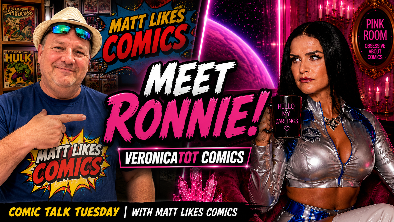
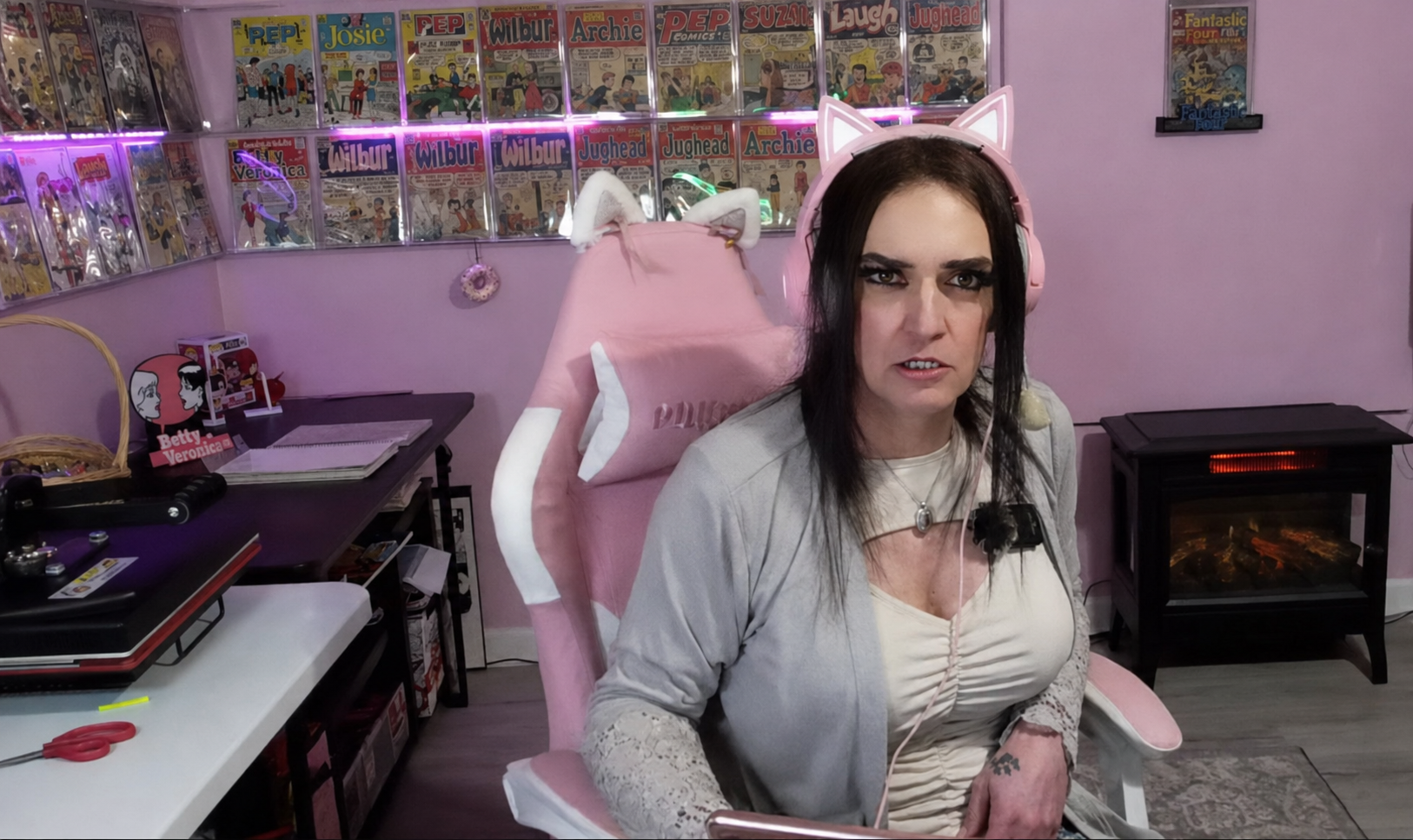
Before the movies, the portals, and all the strange transmissions from the Pink Universe, there was a conversation in the Pink Room.
Matt Likes Comics invited me onto Comic Talk Tuesday to share part of my collection and talk about how I became a comic collector. It sounds like a simple subject, but anyone who truly loves comics knows that our collections are never just stacks of books. Every issue carries a memory, a discovery, a person, or a moment that helped shape us.
Matt Likes Comics and Ronnie during the original Comic Talk Tuesday interview.
More Than a Collection Tour
Matt gave me room to talk about the part of collecting that matters most to me: the story behind it. The books may be the beautiful objects we hold in our hands, but the people, passions, and histories surrounding them are what make a collection personal.
That is what made this interview feel different. It was not a sales pitch or a parade of expensive keys. It was an honest conversation between two people who genuinely love comics—and an opportunity for viewers to meet the woman behind VeronicaTot Comics.
The Pink Room Was Already Telling a Story
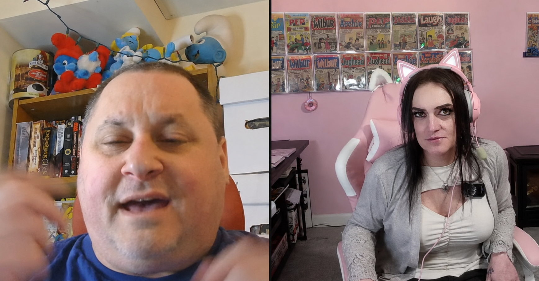
The interview also gave viewers a chance to step inside the Pink Room. Long before it became the home of the Pink Room Picture Show, cinematic portals, classic horror, science fiction, and comic documentaries, the room already represented the same idea: comics could be knowledgeable, personal, glamorous, and completely unapologetic.
Ronnie welcomes viewers into the Pink Room.
The response afterward meant a great deal to me. People loved the Pink Room, and Matt told me I had been one of the most interesting guests he had welcomed onto the show. That stayed with me—not simply because it was flattering, but because it confirmed that there was an audience for comic conversations with personality, atmosphere, and a point of view.
Watch the Original Interview
In this episode of Comic Talk Tuesday, Matt and I look through part of my collection and discuss how my life as a comic collector began.
Watching the interview now, I can see the foundation of so much that came afterward: the Pink Room as a place, the desire to tell deeper comic stories, and the belief that a collector should never have to hide her personality to be taken seriously.
My work has grown since that first conversation. VeronicaTot Comics has expanded, the Pink Room has become its own universe, and my videos now move through comics, horror, science fiction, history, fashion, and storytelling. But the heart of it remains exactly the same—the books, the stories, and the people who love them.
And yes, I will be returning to talk with Matt again. Before that next conversation begins, come back with me to the original interview and see where this chapter of the Pink Room story started.
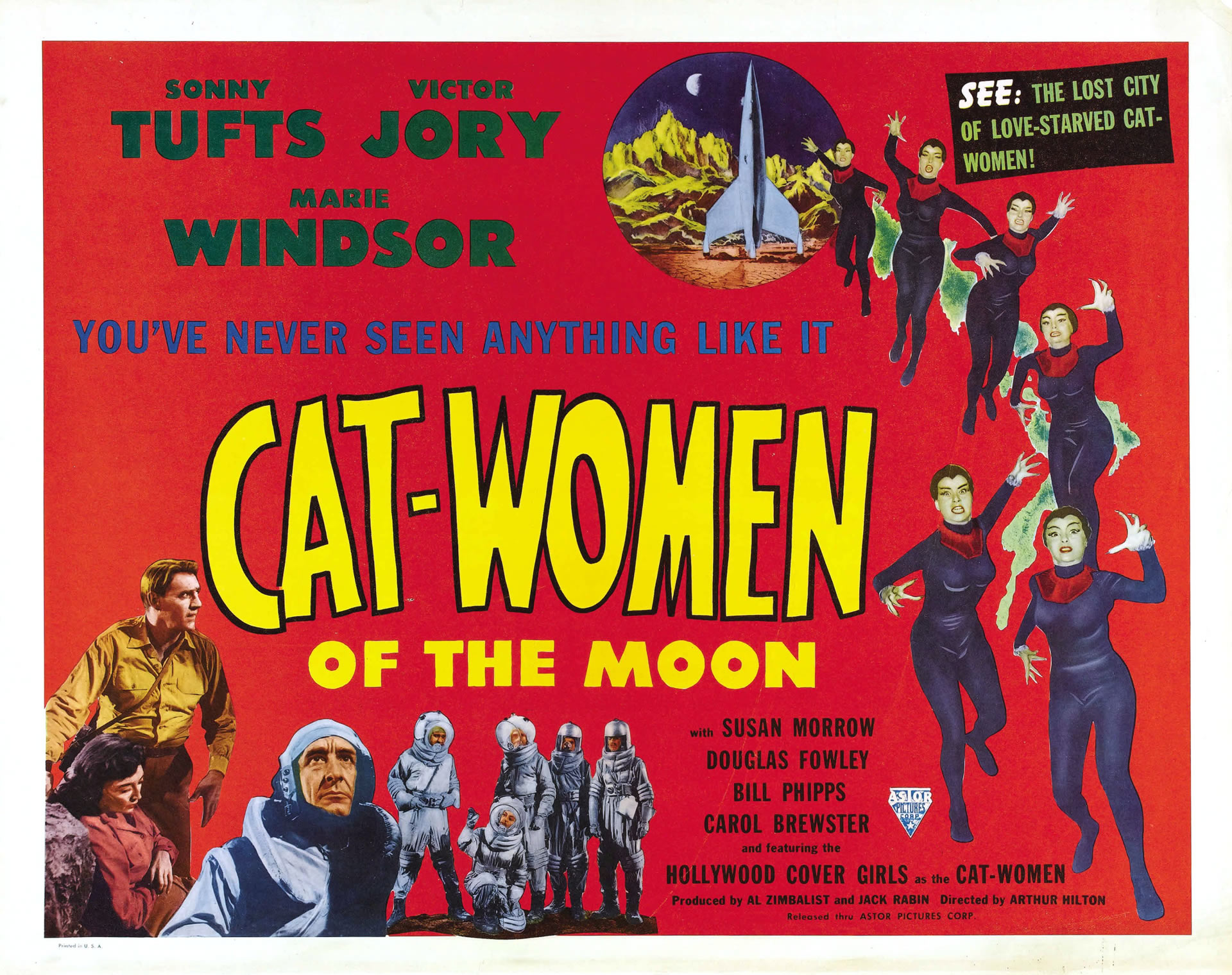
1953 Astor Pictures promotional artwork · Public domain in the United States
The Pink Room Picture Show
The moon is full of beautiful trouble.
Moon Rocket 4 expected rocks, craters and silence. It found telepathic women in black, giant spiders and a civilization planning to steal the ride home.
1953Science Fiction64 MinutesBlack & WhiteOriginally in 3-D
Hello, my darlings. Some motion pictures promise the moon. Cat-Women of the Moon actually takes us there—then fills it with glamour, telepathy, giant spiders, romantic confusion and a plan to steal a rocket.
Released in 1953, this wonderfully strange atomic-age fantasy refuses to behave sensibly. It is pulpy, stylish, occasionally ridiculous and far more interesting than its reputation as a simple “bad movie” suggests. This is not hard science fiction. It is a lunar fever dream built for audiences who wanted to put on their 3-D glasses and discover what beautiful trouble might be waiting beyond Earth.
In other words, it belongs in the Pink Room.
Watch the complete movie with Veronica in the Pink Room
Title
Cat-Women of the Moon
Release
1953
Directed by
Arthur Hilton
Written by
Roy Hamilton
Starring
Sonny Tufts, Victor Jory and Marie Windsor
Music by
Elmer Bernstein
Produced by
Al Zimbalist and Jack Rabin
Runtime
64 minutes
Moon Rocket 4 Has a Problem
The first American expedition to the moon carries Commander Laird Grainger, co-pilot Kip Reisner, navigator Helen Salinger, engineer Walter Wallace and radio operator Doug Smith. Before they even land, Helen seems to know things she should not know. She guides the mission toward a valley on the moon’s dark side without consulting her charts.
Once the astronauts enter a cavern and discover breathable air, the movie abandons caution entirely. The helmets come off. Giant spiders arrive. A hidden lunar city appears. Helen’s strange behavior leads the crew directly toward the women who have been calling her through telepathy.
These are the cat-women: survivors of a dying civilization led by Alpha. Their atmosphere is failing, their world is disappearing and Moon Rocket 4 may be their only chance to escape. They do not merely want assistance. They intend to take the ship, travel to Earth and put themselves in charge.
The dark side of the moon is considerably more glamorous than anyone at Mission Control expected.
Science Fiction Dressed for a Night Out
The cat-women do not look like the final survivors of a collapsing lunar society. They look as though someone interrupted a very exclusive cocktail party. Sleek black costumes, choreographed movement, sculpted hair and theatrical makeup turn the moon into a stage.
That contradiction is part of the charm. The movie is not attempting to show us a plausible extraterrestrial civilization. It is selling fantasy: mysterious chambers, women with mental powers and Earth men who become distracted by beauty, romance, jealousy or a cave filled with gold.
The moon becomes a place where every 1950s anxiety can perform at once. Space travel is exciting but dangerous. Advanced women are alluring but threatening. Technology offers salvation but can be stolen. Even the brave men chosen for humanity’s first lunar mission are remarkably easy to manipulate once desire, ego and greed enter the room.
The title presents the cat-women as the danger, but the astronauts bring plenty of weaknesses with them.
Made for the 3-D Craze
Cat-Women of the Moon arrived during Hollywood’s early-1950s fascination with 3-D. Although most viewers now encounter a flat version, the production was deliberately staged for depth and spectacle. Contemporary exhibition records preserved by the American Film Institute show that prints were offered for conventional, 3-D and widescreen presentation.
That explains the movie’s most enthusiastic visual choices: weapons pointed toward the camera, cavernous spaces, movement aimed into the audience and enormous lunar spiders that exist largely to make people lean backward in their seats.
The production also carries more talent than its modest reputation suggests. Marie Windsor gives Helen precisely the cool, unreadable quality the role needs. Sonny Tufts plays Commander Laird Grainger, Victor Jory is the suspicious Kip Reisner, and the supporting company includes Susan Morrow, Douglas Fowley, William Phipps, Carol Brewster, Suzanne Alexander and the Hollywood Cover Girls.
The score was composed and conducted by Elmer Bernstein, years before his music became inseparable from pictures such as The Magnificent Seven and The Great Escape. Even this tiny lunar adventure received music from a composer destined to become one of Hollywood’s great names.
✦ SIGNAL FROM THE MOON ✦
A Tiny Movie With a Long Shadow
At only 64 minutes, the story moves with the efficiency of a comic book. It launches a rocket, lands on the moon, introduces monsters and a lost civilization, creates a romantic triangle, uncovers a plan to conquer Earth and races toward its conclusion before disbelief can catch up.
The concept proved durable enough to return. Astor Pictures remade the story as Missile to the Moon, expanding and rearranging the details while preserving the irresistible central idea of astronauts discovering a hidden society beneath the lunar surface.
But the original possesses its own handmade magic. The caves feel theatrical. The science is questionable. The giant spiders are gloriously unconvincing. None of that prevents the picture from creating a peculiar atmosphere. It resembles an illustrated pulp cover brought to life—imperfectly, enthusiastically and without the slightest fear of being too much.
Why It Still Belongs in the Pink Room
There is a tendency to treat movies like this as disposable camp, something to mock from a safe modern distance. That is far less interesting than meeting the film on its own terms.
This was a picture made to provide spectacle on limited resources. It appeared while Americans were fascinated by rockets, atomic power, flying saucers, television and the possibility that another world might be close enough to reach. It wrapped those ideas in glamour and gender panic, then sent the entire package to the moon in 3-D.
Does it make sense? Not especially. Does it entertain? Absolutely.
The best cult films create worlds larger than their budgets. Cat-Women of the Moon gives us a dying lunar civilization, telepathic invaders, enormous spiders, gold-filled caverns, doomed romance and an interplanetary power struggle in barely more than an hour. It is audacious, stylish in its own strange way and completely sincere about its absurdity.
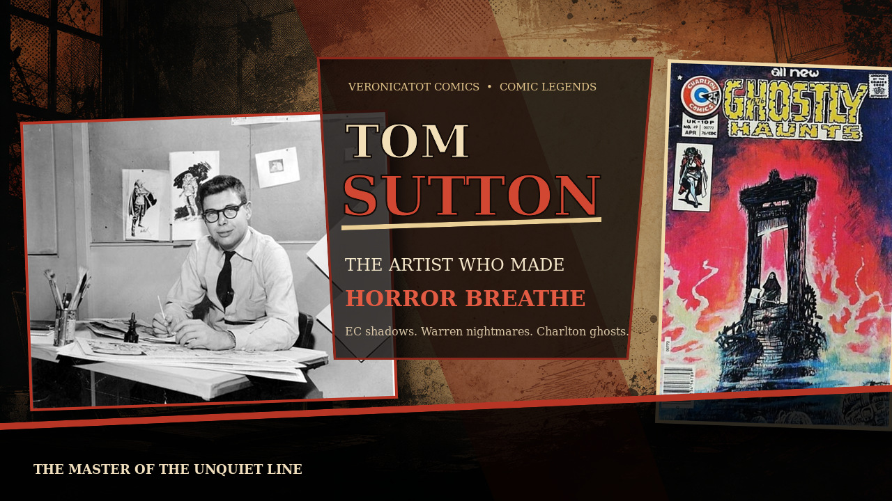
Some artists draw monsters. Tom Sutton made you suspect the monsters had been there before he arrived—and might still be there after you closed the book.
Hello, my darlings.
There is a copy of Ghostly Haunts #49 that keeps pulling me back. It is not a superhero key. There is no celebrated first appearance waiting inside to turn every price guide upside down. What it has is a painted cover by Tom Sutton: a guillotine rising from a feverish red inferno, a lonely hooded figure beneath its blade, and just enough cold blue at the bottom to make the whole scene feel even more impossible.
A guillotine is rarely what one calls tasteful décor, but Sutton makes a persuasive case.
That April 1976 cover explains his appeal better than a tidy checklist ever could. Sutton’s pictures do not simply illustrate horror. They seem to absorb it. His shadows feel damp. His machinery looks overworked. His rooms appear to remember every terrible thing that happened inside them. Even when the story is quiet, the page is never entirely at rest.
This is the story of an artist who moved through Westerns, horror, science fiction, licensed properties, underground work, and nearly every corner of the comics business without ever becoming easy to categorize. Tom Sutton was not polished in the conventional superhero sense. He was better suited to stranger territory.
He could turn an empty corner into a place where even the wallpaper had motives.
Before the Monsters: North Adams, EC Comics, and a Drawing Table
Thomas F. Sutton was born in 1937 and grew up in North Adams, Massachusetts, a New England mill town whose brick factories and long winters sound, in retrospect, almost suspiciously well cast for the beginning of a horror artist’s life.
Drawing became both fascination and refuge. Sutton devoured newspaper strips and comic books, but EC Comics supplied the great revelation. The science-fiction, horror, and war titles associated with artists such as Johnny Craig, Graham Ingels, Wally Wood, and Will Elder showed him how sophisticated commercial comics could be. In a lengthy interview with Gary Groth, Sutton remembered believing that another creative flowering like EC was bound to happen—and wanting to help make it happen.
That expectation would follow him through his career. Publishers often wanted pages completed quickly and inexpensively. Sutton wanted atmosphere, invention, and the freedom to draw the peculiar machinery lurking in the back of his mind. The tension between those two desires is visible throughout his work.
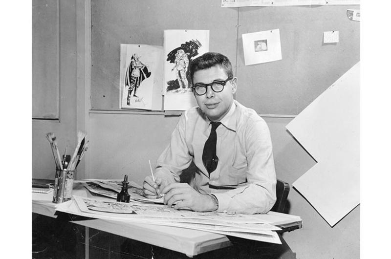
As a boy, Sutton received a sturdy drafting table from his father. Decades later, he was still using it. That detail feels beautifully appropriate: publishers changed, formats disappeared, and entire genres fell in and out of fashion, but Sutton kept returning to the table.
Tom Sutton at his drawing board while serving with the United States Air Force in Japan, 1958. Photograph: Stars and Stripes.
His Real Art School Was in Tokyo
Sutton joined the United States Air Force in 1955 and was stationed in Japan. He eventually landed at the Tokyo office of Stars and Stripes, where he created the daily science-fiction strip Johnny Craig. The title honored one of his favorite EC artists, while the story followed a rocket pilot searching for a second Earth in the distant year of 2058.
It was a formidable apprenticeship. Sutton had to draw on deadline, solve visual problems quickly, and learn beside experienced magazine artists. He later described Stars and Stripes as his art school. It is difficult to imagine a better preparation for comic books: tell the story, make the deadline, and do not wait for inspiration to send a formal invitation.
When Sutton eventually brought examples of that work to Marvel, Stan Lee was impressed that the young artist had already produced a daily strip for two years. Sutton was handed paper and Western assignments. His professional comics career is generally dated to 1967, when a backup story appeared in Rawhide Kid.
Yet superheroes were never his natural habitat. Sutton was interested in environments, atmosphere, strange technology, and the visual possibilities of fear. A clean punch across a clean panel was useful. A crumbling laboratory filled with wires, fog, and something breathing behind the wall was much more his speed.
Warren Publishing Opens the Door
Warren Publishing gave Sutton the territory he had been seeking. In magazines such as Creepy, Eerie, and Vampirella, he could use ink wash, gray tones, deep blacks, and grotesque textures that the standard color comic did not always accommodate.
His early relationship with editor and writer Archie Goodwin was especially important. Sutton remembered Goodwin as an editor who understood drawing as well as writing—someone who could suggest a change without flattening the artist’s personality. That sort of editorial intelligence mattered to Sutton because his best pages depended on rhythm. The shadows, expressions, architecture, and small background disturbances all had to arrive at precisely the right moment.
Sutton also made an essential contribution to one of Warren’s most enduring characters. Vampirella had already appeared as a cover figure, but Sutton became the first artist to draw her in an interior story in Vampirella #1. That distinction is important. He did not create Vampirella, but he helped move her from iconic cover image into sequential life.
And what a natural pairing she was with Sutton: glamorous, theatrical, strange, and surrounded by darkness that knew how to pose.
Tom Sutton’s wonderfully theatrical black-and-white artwork for Vampirella #11. Image reproduced for critical and historical commentary; source and Sutton tribute: StarWarp Concepts.
Charlton Comics and the Freedom of the Shadows
If Warren allowed Sutton to work in atmospheric black and white, Charlton Comics gave his eccentric imagination another kind of playground. The company was famously economical, operating far from the polished center of New York publishing. The rates were modest, the production could be rough, and yet artists sometimes found room there that more prestigious publishers would never have granted them.
Sutton became one of the defining visual voices of Charlton horror. His work appeared in titles including Ghostly Haunts, Ghost Manor, Midnight Tales, and The Many Ghosts of Doctor Graves. He wrote and drew stories, rendered horror hosts, filled panels with occult laboratories and ancient rooms, and created painted covers that looked less like sales displays than recovered evidence.
His Charlton work could be elegant and grotesque in the same panel. Faces stretched toward caricature, but the emotion remained convincing. Backgrounds accumulated scratchy marks and anxious detail. A figure might appear almost comical until Sutton placed it beside something genuinely dreadful. That unstable balance is a central part of his style: he knew that horror becomes more unsettling when it is allowed to grin.
Which brings us back to Ghostly Haunts #49. The issue’s cover is attributed to Sutton as a painting. It does not promise a famous new hero or a universe-changing event. It promises a mood—and then delivers one with alarming confidence.
The interior stories were produced by other creators, an important bibliographic detail, but the cover belongs unmistakably to Sutton’s world. The guillotine is too tall, the fire too vivid, the platform too precarious. Reality has been stretched just enough to become a nightmare.
Sutton did not ask whether a scene was realistic. He asked whether it felt haunted.
Ghostly Haunts #49, April 1976. Painted cover attributed to Tom Sutton. Image: Charlton Tales.
Planet of the Apes and Worlds Built Line by Line
Sutton’s interest in science fiction found one of its richest outlets in Marvel’s black-and-white Planet of the Apes magazine. Working with writer Doug Moench, he helped create the “Future History Chronicles,” a sequence that pushed beyond straightforward movie adaptation into elaborate new territory.
Moench and Sutton shared an enthusiasm that the artist did not always encounter in commercial assignments. Sutton admired Moench’s writing, and their collaboration encouraged the kind of dense world-building he loved: civilizations, machinery, ruins, costumes, creatures, and entire histories suggested in a few crowded panels.
Look closely at one of Sutton’s science-fiction pages and the background rarely behaves like a background. Pipes bend into darkness. Structures multiply. Machines appear to have been repaired by several generations of increasingly desperate mechanics. The setting becomes part of the cast.
That is why his science fiction and horror feel related. Whether he drew a crypt or a spacecraft, Sutton wanted the environment to possess a past. His worlds looked used, damaged, and inhabited. Nothing had just been unboxed.
Star Trek, Likenesses, and the Limits of a Licensed Universe
From 1984 through 1988, Sutton worked extensively on DC’s Star Trek comics. On paper, it sounded ideal: a science-fiction property filled with starships, alien worlds, control panels, and unexplored corners. Sutton accepted the assignment enthusiastically because he loved science fiction, even if he was not approaching it primarily as a devoted Star Trek fan.
The licensed reality proved more restrictive. Character likenesses required attention, reference materials could be inadequate, and some of the elaborate backgrounds Sutton drew were simplified or removed during production. He wanted to discover what existed beyond the television camera’s field of view. The license often wanted what viewers already recognized.
It is the perfect Sutton conflict in miniature: the artist leaning toward the unseen door while the assignment politely asks him to remain on the bridge.
Still, the run demonstrates his range and stamina. Across his career he worked for Marvel, DC, Warren, Charlton, Skywald, First, Dark Horse, and other publishers. His credits touched Westerns, superheroes, horror, science fiction, licensed entertainment, independent comics, commercial illustration, and gallery painting. He could work almost anywhere. He simply looked most at home when the lights were low.
The Beauty of the Unquiet Line
It is tempting to praise comic artists only for refinement: clean anatomy, precise perspective, handsome faces, perfect machinery. Sutton’s greatness lives somewhere less comfortable.
His line trembles, scratches, pools, and crawls. It can be lush in one panel and brutally economical in the next. His monsters are not arranged for admiration; they intrude. His human beings look vulnerable because their faces are allowed to bend under fear, greed, exhaustion, and disbelief.
The obvious ancestors are the EC artists Sutton loved, but his work never settles into imitation. There are echoes of Graham Ingels in the rot, Wally Wood in the machinery, and Will Elder in the manic density, yet Sutton’s pages remain his own—more nervous, more improvisational, and sometimes almost feverish.
That fever is precisely why the work survives changes in fashion. Smooth commercial illustration can age when the fashion it served disappears. Sutton’s pictures were never entirely fashionable to begin with. They were personal disturbances smuggled into commercial assignments.
An Artist at the Drawing Board
Tom Sutton died in May 2002 at the age of 65. Contemporary reports stated that he was found at his drawing board. It is an ending almost too perfectly composed for a legend, so it deserves to be handled without melodrama. Sutton spent his life drawing. At the end, the table was still there.
His career was not a neat ascent toward one famous title. It was a long, unruly passage through the less predictable rooms of American comics. He could be brilliant, rushed, inventive, frustrated, hilarious, and brutally candid about the industry. Even Sutton acknowledged that the quality of his work varied. But when the material, deadline, and creative freedom aligned, very few artists could make a page feel so thoroughly possessed.
Why I Keep Returning to Ghostly Haunts #49
Collectors are trained to ask what happens inside a comic. Is it a first appearance? A major death? A scarce variant? An overlooked key?
Those questions matter, but they are not the only reasons to love a book.
Sometimes the key is the artist.
Ghostly Haunts #49 reminds me that collecting can still begin with the oldest and best response: I saw the cover, and I had to know more. Not because a database instructed me to want it. Not because a film announcement made it hotter overnight. Because one image created a whole world before I ever opened the book.
That is Tom Sutton’s gift. He makes us curious about the darkness. He gives the darkness architecture, texture, and a rather suspicious sense of humor. Then he leaves the door open.
Cover and interior artwork discussed in this editorial remain the property of their respective rights holders and are presented for identification, criticism, historical discussion, and commentary.
The Code loosened its grip. Coffins opened. Swamps stirred. And American comics discovered that monsters could be tragic, glamorous—and heroic.
A collector’s guide to the beautiful darkness
1971
The lock clicks open.
Bronze Age horror did not merely revive old monsters. It taught an entire generation of comics how to live in the shadows.
For years, the Comics Code had pushed vampires, werewolves, ghouls and overt horror to the edges of mainstream newsstands. Then the 1971 revision permitted classic monsters when handled in a recognized literary tradition. The language remained cautious, but the creative door had opened—and publishers rushed through it with capes, claws, curses and impeccable cover art.
The result was not a return to the pre-Code shock comic. It was something stranger and, in many ways, more enduring: the monster as protagonist. Dracula could carry a long-running Marvel title. A doomed teenager could become Werewolf by Night. A flaming skeleton could roar across a cover like the patron saint of supernatural rebellion.
The Rule That Changed the Rack
Classic monsters were invited back in.
The 1971 Code revision specifically allowed vampires, ghouls and werewolves when treated in the tradition of works such as Frankenstein, Dracula and respected supernatural literature. Publishers understood the opportunity immediately.
That single change helped transform horror from a forbidden category into a new engine for character creation. The decade’s best supernatural books mixed Gothic atmosphere with superhero continuity, social anxiety, tragic romance and pure grindhouse electricity.
Vampires, ghouls and werewolves could return—provided they entered through the door of classic literature.
Paraphrased from the 1971 Comics Code revision
The Hands Behind the Shadows
Horror has an artist’s fingerprint.
The Bronze Age is not one style. It is Wrightson’s Gothic brushwork, Colan’s moving shadows, Ploog’s pulpy ferocity—and Tom Sutton’s gloriously unrestrained nightmares.
Before the 1971 Code revision reopened mainstream comic racks to classic monsters, Warren’s magazine-format horror had already created a place for darker work. Tom Sutton became the first story artist of Vampirella and then carried his frantic, atmospheric line into Warren, Marvel and the wonderfully strange Charlton horror books of the 1970s.
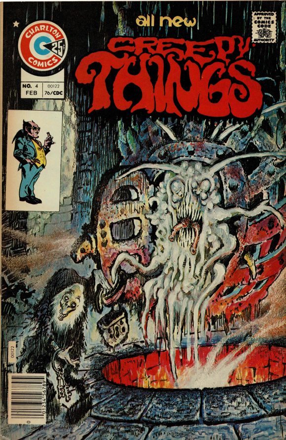
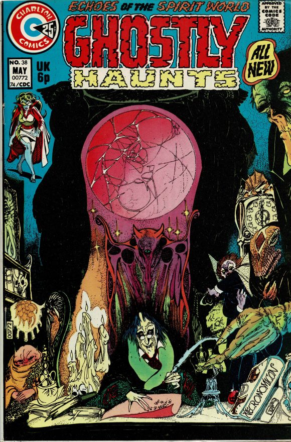
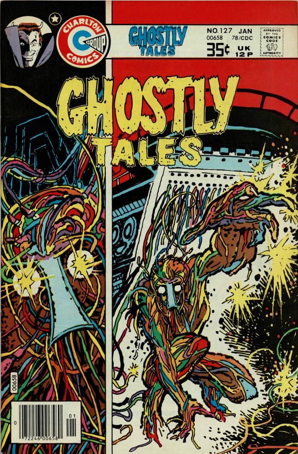
Tom Sutton’s painted nightmares
These Charlton covers show why Sutton deserves a place in any Bronze Age horror conversation: crowded compositions, theatrical terror and color that feels one heartbeat away from chaos.
Creepy Things #4
Tom Sutton cover art · CharltonGhostly Haunts #38
Tom Sutton cover art · CharltonGhostly Tales #127
Tom Sutton cover art · Charlton
Three architects of the darkness
Bernie Wrightson
Co-creator of Swamp Thing and the master whose intricate pen and brush work made decay feel almost romantic.
Photo: Corey Bond · CC BY-SA 3.0 · Wikimedia Commons
Gene Colan
The visual soul of Tomb of Dracula, drawing fog, motion and menace as though every panel were lit by moonlight.
The writer who helped turn Tomb of Dracula into a landmark run and co-created Blade with Gene Colan.
Photo: Noel Wolfman · Public domain · Wikimedia Commons
Historic comic covers are reproduced at low resolution for criticism and commentary; all cover art and characters remain the property of their respective rights holders. Cover image source: 13th Dimension’s Tom Sutton Charlton gallery.
Six Doors Into the Era
The keys that define the comeback.
Not every important horror book is scarce. Not every classic cover contains a first appearance. The magic is learning what kind of importance you are holding.
DC · 1971
House of Secrets #92
Len Wein and Bernie Wrightson’s first Swamp Thing story is Gothic tragedy distilled into one unforgettable issue. DC identifies it as the character’s first appearance, and Wrightson’s cover remains one of the defining images of Bronze Age horror.
Collector lens · first appearance + iconic cover
Marvel · 1971
Amazing Spider-Man #101
Morbius arrived as a “living vampire”—scientific enough to enter Spider-Man’s world, monstrous enough to announce that the old restrictions were losing their power. It is the perfect bridge between superhero comics and the supernatural boom.
Collector lens · major debut in a flagship title
Marvel · 1972
Tomb of Dracula #1
Dracula did not sneak back as a guest villain. He claimed his own title. The series would run from 1972 through 1979 and become one of Marvel’s signature horror achievements, with Gene Colan’s shadow-soaked storytelling central to its identity.
Collector lens · launch of a landmark horror run
Marvel Spotlight · 1972
Marvel Spotlight #2
The first appearance of Jack Russell’s Werewolf by Night turned lycanthropy into an ongoing family curse. Mike Ploog’s art brought a raw, pulpy energy that makes the early issues feel less like standard superheroes and more like midnight cinema.
Collector lens · first appearance + monster magazine mood
Marvel Spotlight · 1972
Marvel Spotlight #5
Johnny Blaze’s first appearance as Ghost Rider is pure Bronze Age spectacle: stunt motorcycles, a bargain with darkness and the immortal visual of a flaming skull in motion. Horror had officially become superhero mythology.
Collector lens · enduring character + unforgettable design
Marvel · 1973
Tomb of Dracula #10
Blade’s first appearance proved that the horror revival could create heroes as culturally durable as any costumed crime-fighter. He did not merely survive the vampire genre—he helped carry it into comics, film and the modern Marvel universe.
Collector lens · first Blade, born inside a horror title
Buying With Your Eyes Open
Condition is part of the story.
Bronze Age horror covers often make defects impossible to hide—and that is precisely why beautiful copies feel so luxurious.
Inspect the dark fieldsBlack, navy and deep red covers advertise color-breaking spine ticks, rub and edge wear.
Check every attachment pointConfirm the cover, staples and centerfold are secure before deciding what the grade might be.
Look for missing insertsValue stamps, coupons and interior cutouts can matter far more than a glossy front-cover photograph suggests.
Separate rarity from demandA first appearance, classic cover, scarce issue and fan-favorite run are four different collecting arguments.
Respect the paperA conservative press may improve suitable non-color-breaking defects, but no treatment should gamble with a key book’s structure.
Why the Era Still Matters
Bronze Age horror made the monster beautiful enough to collect and complicated enough to love.
These books sit at the crossroads of classic cinema, Gothic literature, superhero continuity and 1970s counterculture. They gave artists permission to work in shadow. They gave writers protagonists who could be cursed, morally uncertain or visibly monstrous. And they gave collectors a category where a single issue can be a first appearance, a cover masterpiece and a tiny piece of cultural rebellion all at once.
That is why the best Bronze Age horror keys do not feel like relics. They still feel dangerous on the wall.
Enter the Collection
Buy the book that haunts you.
Veronicatot Comics eBay Store is where comics, artifacts and dark little treasures wait for their next caretaker. And when an older key needs careful presentation work, the Pink Room Spa puts preservation first.
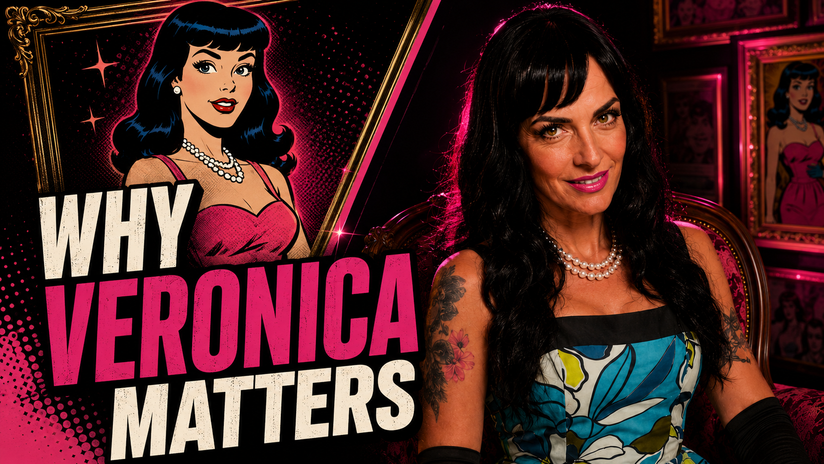
I did not call myself VeronicaTot Comics by accident. Veronica Lodge may not be my favorite Archie character—that crown has always belonged to Jughead—but favorite and influence are not the same thing.
Jughead was the character I loved. Veronica was the character I studied. She entered every scene as though she already belonged there. She loved fashion, elegance and beautiful things, and she was never afraid to be seen.
People often reduce Veronica to “the rich girl”: spoiled, vain and forever standing between Archie and Betty. That is only the surface. Beneath the diamonds, sports cars and impossible wardrobe is one of the most confident, adaptable and misunderstood women in comic-book history.
Veronica Lodge first appeared in Pep Comics #26 in 1942, and Riverdale was never quite the same again. Archie already had Betty Cooper: capable, familiar and right there next door. Veronica arrived from outside that comfortable world carrying wealth, sophistication and an entirely different kind of energy.
Archie did not simply gain another romantic interest. Riverdale gained contrast. Betty represented the girl everyone already knew; Veronica represented the girl everyone noticed when she entered the room.
Money alone is not charisma. Plenty of wealthy characters have come and gone. Veronica endured because she had presence. She wanted the best seat, the best dress and the last word. She could be charming one moment and infuriating the next, but she was never invisible.
1942Debuts in Pep Comics #26
1989Her solo series begins
2011The 210-issue run concludes
TodayStill commanding every universe
Glamour Is Part of the Story
Watch Veronica evolve through the covers and the fashions change while her posture barely does. Hemlines rise and fall. Evening gowns give way to mod looks, disco glamour, preppy polish and modern power dressing. Through every decade, the chin remains up and the expression composed. She knows people are looking, and she is perfectly comfortable with that.
Fashion in comics is not merely decoration. Comics are a visual medium, and clothing tells us who a character believes she is before she says a word. Veronica’s wardrobe communicates taste, privilege, ambition, control and sometimes glorious excess.
Her glamour was not a disguise. It was a declaration: I am here. I know who I am. You may look.
There is nothing shallow about enjoying beauty. Presentation can be part of authorship—the way we tell the world who we are before anyone else gets to write the introduction.
Confident, Spoiled and Complicated
Let us be honest: Veronica can be spoiled. She can be jealous, competitive, demanding and spectacularly out of touch. She has used money to get her way, treated Archie like a prize and occasionally behaved as though all of Riverdale were an extension of Lodge Manor.
I would not erase any of it. Those flaws are not a failure of the character; they are character. Too often a confident woman is only considered likable after a story softens her, humbles her or teaches her to take up less space. Veronica can learn a lesson without surrendering her identity. She can be generous without pretending she no longer enjoys luxury.
Confidence in women is frequently rewritten as vanity by people who find modesty easier to admire than self-possession. Veronica forces us to sit with the difference. She can be vain and still be brave, loyal, resourceful, funny and genuinely kind. The best stories allow all of those things to be true.
Betty and Veronica Are the Real Love Story
The familiar shorthand is Betty versus Veronica: the wholesome blonde against the glamorous brunette, the girl next door against the socialite, two women competing for Archie Andrews. That triangle may be one of comics’ most durable engines, but it is not the whole relationship.
Betty and Veronica are not virtue and vice. They are two kinds of female power. Betty is practical, warm and persistent. Veronica is polished, assertive, socially fearless and ambitious. Each possesses qualities the other admires, and each can drive the other completely crazy.
They compete, travel, scheme, rescue and forgive one another. The covers may sell the rivalry, but the friendship gives it meaning. The older I get, the less interested I am in asking whom Archie should choose. The more interesting question is why Betty and Veronica continue to choose each other.
She Became the Headliner
Veronica began inside Archie’s world, but she did not remain a supporting character. She shared the spotlight in Betty and Veronica, starred in countless stories and digests, and received her own ongoing series in 1989. That title ran for 210 issues through 2011.
A character who might have remained one point of a romantic triangle proved she could carry comedy, fashion, family stories, travel and an entire supporting cast under her own name. She became a destination.
That same strength lets Veronica survive reinvention. Adam Hughes could make Betty & Veronica sleeker and more cinematic. Archie Horror could transform her into Vampironica, turning elegance gothic and confidence dangerous. The universe can change around her, but Veronica still commands the frame.
◆ ◆ ◆
Why Veronica Lodge Mattered to Me
I did not want Veronica’s money. I wanted her confidence—the way she walked into a room as though she belonged there, her ease with glamour, her love of beautiful things and her refusal to apologize for being noticeable.
She showed me that comics and couture were never opposites. Femininity did not make a comic fan less serious. You could know the history, care about the creators, love the paper, the art, the hunt and the strange little details collectors obsess over—and still arrive with style.
VeronicaTot Comics, the Pink Room and the belief that comics deserve couture too did not come from one fictional character. But Veronica Lodge gave me a language for combining things people sometimes insist must remain separate: intelligence and beauty, collecting and presentation, sincerity and spectacle, comics and glamour.
The name is not about pretending to be Veronica Lodge. It is about recognizing what she represented to me: permission.
Permission to be visible. Permission to enjoy beautiful things without defending them. Permission to be confident before everyone else has agreed that you have earned it.
Veronica did not become an icon because she was flawless. She became an icon because she was impossible to overlook. More than eight decades after she first entered Riverdale, she still reminds us to know who we are, dress for the entrance we deserve and never be afraid to make the room make room for us.
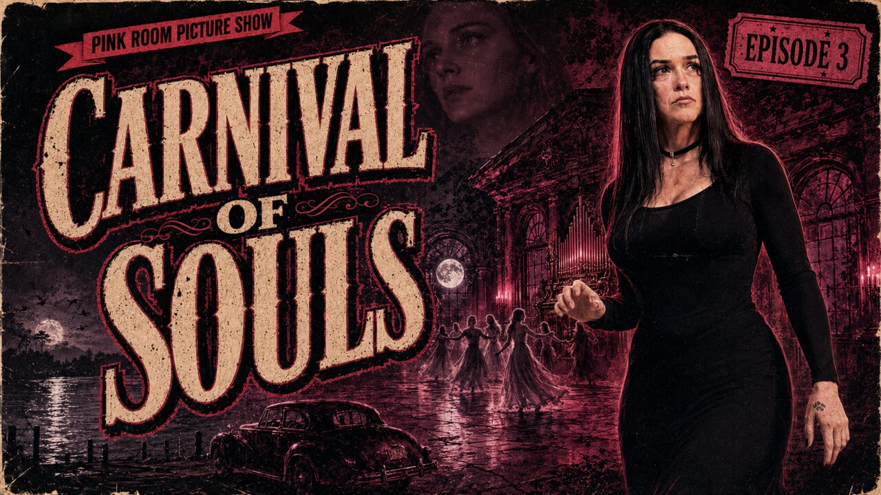
Hello, my darlings—and welcome to the abandoned pavilion, where the organ plays after midnight, pale figures dance beneath broken lights and one woman cannot decide whether she escaped death or merely wandered deeper inside it.
Carnival of Souls is not interested in loud shocks. It works through silence, distance and disconnection, following Mary Henry through a world that gradually stops acknowledging her existence.
Watch the complete movie with Veronica in the Pink Room
Title
Carnival of Souls
Release
1962
Director & producer
Herk Harvey
Writer
John Clifford
Starring
Candace Hilligoss, Frances Feist, Sidney Berger and Herk Harvey
Music
Gene Moore
The Woman Who Walked Out of the River
A car carrying three young women plunges from a bridge into a muddy river. Hours later, Mary Henry emerges from the water as the only apparent survivor. She leaves Kansas for a new job as a church organist in Utah, determined to build a life untouched by the tragedy.
But Mary never fully rejoins the living world. Conversations feel distant. People seem unable to hear her. A pale man appears in windows and reflections, watching with an expression that is less violent than inevitable. At the edge of the city stands an abandoned lakeside pavilion, and Mary feels drawn toward it despite every instinct telling her to stay away.
The terror is not that Mary is being chased. It is that the world may already have let her go.
Candace Hilligoss and the Loneliness of Mary Henry
Candace Hilligoss gives Mary a cool, guarded presence. She is independent without seeming secure, observant without understanding what she sees and increasingly frightened by the possibility that her isolation is not merely emotional.
Mary’s refusal to perform warmth for the people around her makes her unusual for a heroine of the period. She does not want romance, community or the approval of her intrusive neighbor John Linden. She wants work, privacy and control. The film slowly removes each of those certainties.
The Pavilion at the Edge of Reality
The abandoned Saltair pavilion is one of horror cinema’s great locations. Its long corridors, empty dance floor and decaying architecture feel designed for a celebration that ended decades ago but never truly stopped.
Herk Harvey first saw the ruined resort while passing through Utah and imagined pale figures rising from the water to dance inside it. That image became the film’s center. The pavilion is not simply haunted; it seems to occupy a space where memory, death and desire overlap.
An Organ Score from Another World
Gene Moore’s organ music gives the film its pulse. Because Mary is an organist, the sound belongs naturally to her everyday life, yet it also seems to come from somewhere beneath the story. Sacred chords twist into carnival rhythms, and the familiar instrument becomes a doorway.
The score allows the movie to drift between the real and unreal without announcing the transition. By the time the ghouls begin their dance, the music has already taught us that Mary’s world can change shape at any moment.
☾
Herk Harvey’s One Impossible Feature
Harvey spent most of his career directing industrial and educational films for the Centron Corporation in Lawrence, Kansas. Carnival of Souls was his only feature, made with a small regional crew and photographed on location in Kansas and Utah.
Its limited resources became its aesthetic. Empty streets, harsh daylight, doubled voices and ordinary rooms acquire an uncanny stillness. What might look imperfect in another production feels here like evidence that Mary has slipped slightly out of alignment with reality.
The Film That Would Not Stay Buried
The initial release did little to establish the movie, but late-night television and revival screenings gradually found its audience. Filmmakers and critics recognized its dream logic, stark photography and sense of cosmic isolation.
Its influence can be felt in later psychological horror and in filmmakers fascinated by unstable identity and haunted spaces. Criterion’s restoration and the Academy Film Archive’s preservation work helped secure the film’s place as far more than an accidental midnight curiosity.
Why It Belongs in the Pink Room
Carnival of Souls belongs in the Pink Room because it turns atmosphere into an entire universe. It proves that horror can be elegant, lonely and beautiful—that a deserted ballroom and a few distant figures can disturb us more deeply than spectacle.
Mary Henry walks through doors without knowing whether they lead toward life or away from it. That uncertainty is the film’s spell, and more than sixty years later, the music still calls audiences back to the pavilion.
George A. Romero turns one lonely Pennsylvania farmhouse into a nightmare that changed horror cinema forever.
1968HorrorBlack & WhiteNational Film RegistryPublic Domain in the U.S.
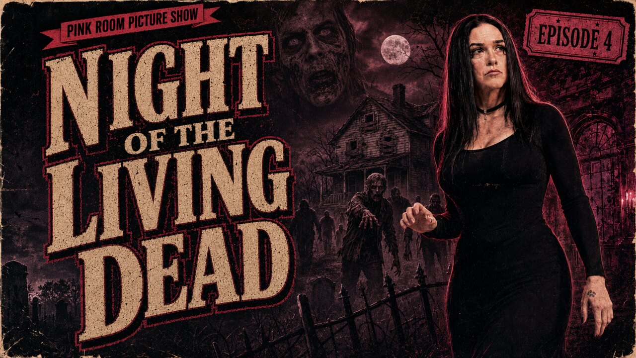
Hello, my darlings—and welcome to the night when the cemetery stopped being quiet, the farmhouse became a fortress and the dead discovered they could walk.
Night of the Living Dead did not merely introduce a new kind of monster. George A. Romero’s stark 1968 nightmare changed where horror could happen, who could stand at its center and how mercilessly a movie could confront its audience.
Watch the complete movie with Veronica in the Pink Room
Title
Night of the Living Dead
Release
1968
Director
George A. Romero
Writers
George A. Romero and John A. Russo
Starring
Duane Jones, Judith O’Dea, Karl Hardman, Marilyn Eastman, Judith Ridley and Keith Wayne
Production
Image Ten
They’re Coming to Get You, Barbra
The opening is almost playful. Barbra and her brother Johnny visit their father’s grave, trading complaints and childhood teasing beneath a pale sky. Then a strange man appears among the stones. Within minutes Johnny is dead, Barbra is fleeing through the countryside and the familiar world has ended without warning.
She reaches an isolated farmhouse where Ben, played by Duane Jones, takes control. He boards the windows, searches for supplies and tries to understand the scattered radio reports. Other survivors emerge from the cellar, but safety becomes impossible when fear, pride and incompatible plans turn the people inside against one another.
The monsters outside are terrifying. The certainty that the people inside cannot cooperate is worse.
Duane Jones Changes the Center of the Story
Ben is intelligent, decisive and physically capable—the person most prepared to survive. Duane Jones gives him authority without turning him into a simple action hero. He thinks, listens, argues and sometimes loses his temper because the situation demands more from him than anyone should have to give.
Romero and his collaborators said Jones was cast because he was the best actor available, and the screenplay was not rewritten around his race. Yet placing a Black man at the center of an American horror film in 1968 inevitably transformed the movie’s meaning. Ben’s struggle for control inside the farmhouse and the devastating final images carry a force the filmmakers could not separate from the world outside the theater.
A New Kind of Living Dead
Earlier screen zombies were often linked to hypnosis, magic or distant exoticism. Romero’s creatures are ordinary dead people returned with an appetite for living flesh. They move slowly, gather in numbers and turn every familiar neighbor into a possible threat.
The movie calls them ghouls, but audiences recognized the foundation of the modern zombie. Countless later films, television series, comics and games inherited Romero’s rules: destroy the brain, fear the bite and understand that one creature is manageable while a crowd becomes the end of civilization.
Horror in an Ordinary Place
The farmhouse is not a Gothic castle or a laboratory. It is a plain rural home filled with furniture, tools, a television and a cellar. That familiarity makes the siege feel immediate. The nightmare is not happening in a distant land; it is unfolding down the road.
The grainy black-and-white photography gives the images the urgency of news footage. Radio and television broadcasts provide fragments of explanation, but no comforting authority arrives to restore order. The world beyond the boards feels as frightened and confused as the people trapped inside.
✦
The Ending That Refuses Comfort
Without spoiling every turn for viewers entering the farmhouse for the first time, the conclusion remains one of the most brutal in American horror. Romero does not reward competence, courage or audience loyalty. Morning does not guarantee salvation.
The final sequence of still photographs resembles documentary evidence rather than a conventional movie ending. The horror continues after the last scream because the images force us to consider not only what happened, but how casually the world processes it.
From Regional Production to American Landmark
Made independently around Pittsburgh, Night of the Living Dead became a phenomenon far beyond its modest resources. Its violence shocked early audiences, its bleakness divided critics and its influence spread through nearly every corner of modern horror.
In 1999, the Library of Congress selected the film for the National Film Registry as a work of cultural, historical or aesthetic significance. The honor recognized what horror fans already knew: this was not merely a successful monster movie. It was a turning point in American cinema.
Why It Belongs in the Pink Room
The Pink Room Picture Show celebrates films whose imagination exceeded their budgets and whose creators built worlds that audiences could never forget. Few movies embody that spirit more completely than Night of the Living Dead.
It is raw, intelligent, frightening and unwilling to flatter us. More than half a century later, the farmhouse door still feels fragile, the radio reports still feel urgent and the figures moving across the field still make us check the windows.






.jpg?width=800)

.jpg)
.jpg)


.jpg)
_poster_1.jpg)